Welcome!

By registering with us, you'll be able to discuss, share and private message with other members of our community.

SignUp Now!
  • Guest, before posting your code please take these rules into consideration:
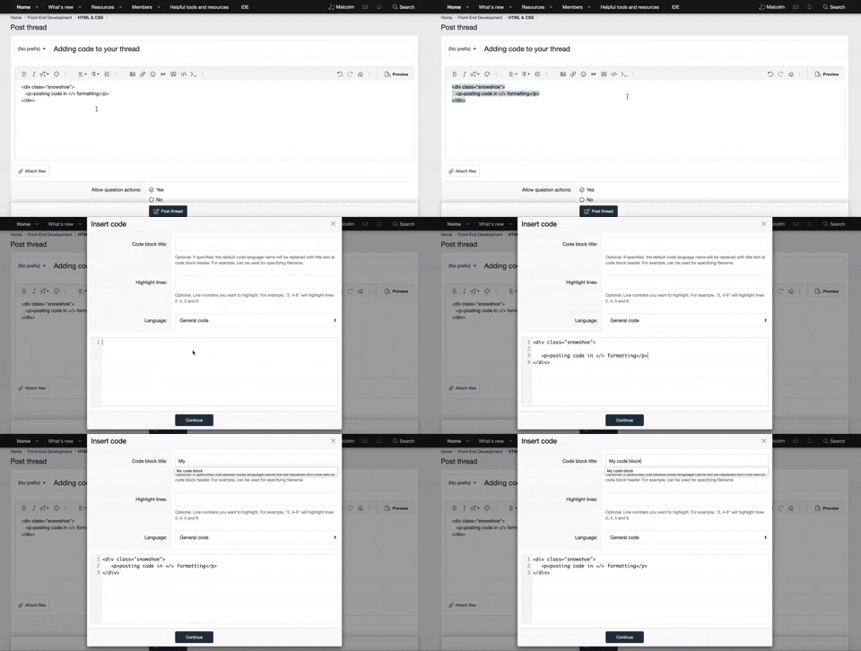
    • It is required to use our BBCode feature to display your code. While within the editor click < / > or >_ and place your code within the BB Code prompt. This helps others with finding a solution by making it easier to read and easier to copy.
    • You can also use markdown to share your code. When using markdown your code will be automatically converted to BBCode. For help with markdown check out the markdown guide.
    • Don't share a wall of code. All we want is the problem area, the code related to your issue.


    To learn more about how to use our BBCode feature, please click here.

    Thank you, Code Forum.

HTML & CSS Best way to position div elements side by side?

Malcolm

Administrator
Administrator
Staff Team
Code Plus
Company Plus
Hello all,

I have recently submerged myself into another project. I'm trying to place to div elements side by side. I've figured out two ways of doing it and want to know how you would do it. The two ways I did it are:

Method 1:​

[CODE lang="html" title="HTML Code"]<div class="div1"></div>
<div class="div2"></div>
<div class="div3"></div>[/CODE]

CSS:
div {
    margin-left:-4px;
}

.div1 {
    display: inline-block;
    width: 100px;
    height: 100px;
    background-color:red;
}
.div2 {
    display: inline-block;
    width: 100px;
    height: 100px;
    background-color:blue;
}
.div3 {
    display: inline-block;
    width: 100px;
    height: 100px;
    background-color:green;
}
Without adding margin-left -4px there would be a gap between the elements (Not sure why).

Method 2:​

[CODE lang="html" title="HTML Code"]<div class="mainDiv">
<div class="div1"></div>
<div class="div2"></div>
</div>
[/CODE]
CSS:
.div1 {
    background-color: red;
    height: 100px;
    width: 100px;
}
.div2 {
    background-color: blue;
    height: 100px;
    width: 100px;
    position: relative;
    top:-100px;
    left: 100px;
}
This code allows me to position the div elements side by side without using the Display property but using the position property.

Those were two ways I came up with to make two elements appear side by side, is there any other way of doing this?
 
Solution
The children of a container with display flex are positionned one after the order in a row or column (Row by default). It can be configured with many options. It is quite powerful. The only down side, as far as I know, is that it is not supported by Internet Explorer. I find this page to give a good explanation of "display: flex;".
 
Solution
I just tried it! Oh my, it works amazingly!

HTML:
<div class="mainDiv">
    <div class="div1" style="background-color:red; width:100px;height:100px;"></div>
    <div class="div2" style="background-color:green; width:100px;height:100px;"></div>
</div>
CSS:
.mainDiv {
    display:flex;
}
So simple?!

1607235533486.webp
 
I know this has been answered but your best bet is going to be bootstrap 😀

you could simply go

Code:
<div class="row">

    <div class="col">
    </div>

    <div class="col">
    </div>

    <div class="col">
    </div>

</div>

that would give you a fully responsive, mobile ready, table layout. Although display flex will work it will work out easier in the long run using bootstrap and it will save on codeing time 😀
I like bootstrap as well, but I like making websites completely from scratch.
 

New Threads

Buy us a coffee!

Back
Top Bottom