Welcome!

By registering with us, you'll be able to discuss, share and private message with other members of our community.

SignUp Now!
  • Guest, before posting your code please take these rules into consideration:
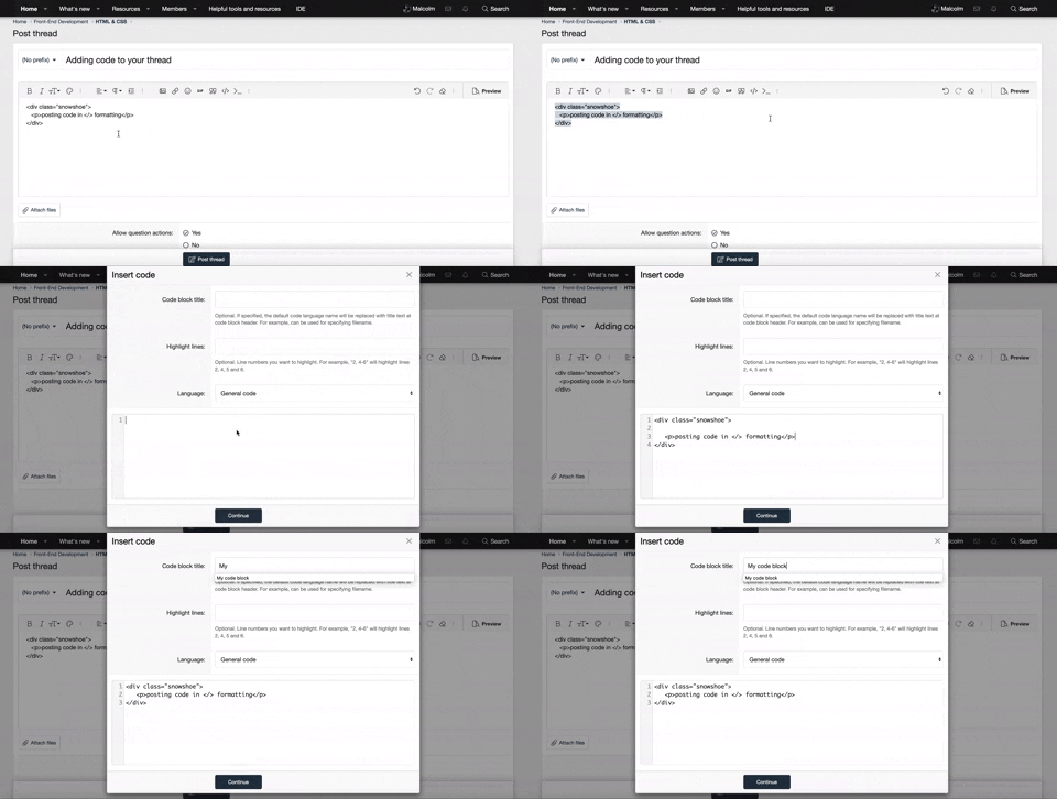
    • It is required to use our BBCode feature to display your code. While within the editor click < / > or >_ and place your code within the BB Code prompt. This helps others with finding a solution by making it easier to read and easier to copy.
    • You can also use markdown to share your code. When using markdown your code will be automatically converted to BBCode. For help with markdown check out the markdown guide.
    • Don't share a wall of code. All we want is the problem area, the code related to your issue.


    To learn more about how to use our BBCode feature, please click here.

    Thank you, Code Forum.

st3lla

New Coder
Greetings!

I would like to use this code from Blankslate Wordpress theme to render into the menu W3Schools example:

https://www.w3schools.com/howto/tryit.asp?filename=tryhow_js_mobile_navbar

Code:
<nav id="menu">
<div class="menu-topnav-container">
<ul id="menu-topnav" class="menu">
<li id="menu-item-39" class="menu-item menu-item-type-custom menu-item-object-custom current-menu-item current_page_item menu-item-home menu-item-39"><a href="https://utv.stfgrpch.se/" aria-current="page">Hem</a></li>
<li id="menu-item-40" class="menu-item menu-item-type-post_type menu-item-object-page menu-item-40"><a href="https://utv.stfgrpch.se/sida-1/">sida 1</a></li>
<li id="menu-item-41" class="menu-item menu-item-type-post_type menu-item-object-page menu-item-41"><a href="https://utv.stfgrpch.se/sida-2/">sida 2</a></li>
</ul>
</div>
</nav>

And I can't just figure it out, my google-skills hasn't helped me with this question, so now I'm reaching out!

Best regards!
 
Hello st3lla,

Here your menu is merged with the example you linked:
HTML:
<!DOCTYPE html>
<html>
<head>
<meta name="viewport" content="width=device-width, initial-scale=1">
<link rel="stylesheet" href="https://cdnjs.cloudflare.com/ajax/libs/font-awesome/4.7.0/css/font-awesome.min.css">
<style>
body {
  font-family: Arial, Helvetica, sans-serif;
}

.mobile-container {
  max-width: 480px;
  margin: auto;
  background-color: #555;
  height: 500px;
  color: white;
  border-radius: 10px;
}

.topnav {
  overflow: hidden;
  background-color: #333;
  position: relative;
}

.topnav a {
  color: white;
  padding: 14px 16px;
  text-decoration: none;
  font-size: 17px;
  display: block;
}

.topnav a.icon {
  background: black;
  display: block;
  position: absolute;
  right: 0;
  top: 0;
}

.topnav a:hover {
  background-color: #ddd;
  color: black;
}

.active {
  background-color: #4CAF50;
  color: white;
}

#menu {
  display: none;
}

</style>
</head>
<body>

<!-- Simulate a smartphone / tablet -->
<div class="mobile-container">

<!-- Top Navigation Menu -->
<div class="topnav">
  <a href="#home" class="active">Logo</a>
  <nav id="menu">
    <div class="menu-topnav-container">
      <ul id="menu-topnav" class="menu">
      <li id="menu-item-39" class="menu-item menu-item-type-custom menu-item-object-custom current-menu-item current_page_item menu-item-home menu-item-39"><a href="https://utv.stfgrpch.se/" aria-current="page">Hem</a></li>
      <li id="menu-item-40" class="menu-item menu-item-type-post_type menu-item-object-page menu-item-40"><a href="https://utv.stfgrpch.se/sida-1/">sida 1</a></li>
      <li id="menu-item-41" class="menu-item menu-item-type-post_type menu-item-object-page menu-item-41"><a href="https://utv.stfgrpch.se/sida-2/">sida 2</a></li>
      </ul>
    </div>
  </nav>
  <a href="javascript:void(0);" class="icon" onclick="myFunction()">
    <i class="fa fa-bars"></i>
  </a>
</div>

<div style="padding-left:16px">
  <h3>Vertical Mobile Navbar</h3>
  <p>This example demonstrates how a navigation menu on a mobile/smart phone could look like.</p>
  <p>Click on the hamburger menu (three bars) in the top right corner, to toggle the menu.</p>
</div>

<!-- End smartphone / tablet look -->
</div>

<script>
function myFunction() {
  var x = document.getElementById("menu");
  if (x.style.display === "block") {
    x.style.display = "none";
  } else {
    x.style.display = "block";
  }
}
</script>

</body>
</html>
 
Basically, your menu must start with the CSS style display: none; and it must have the same id as in the following line in the JS script var x = document.getElementById("menu");.
 
Hi LTomy!

When I read my post and your reply, I see that I managed to explain to opposite to what I wanted.

I want to use the example code from W3 in the wordpress theme, so what I don't understand is what classes from the theme code to be used in the style sheet.

What should I for example replace .topnav in the css with from the theme code!?

Sorry and once again, thanks!
 
When called, the following function will show/hide (toggle) the element with the id 'menu':
HTML:
<script>
function toggleMenuDisplay() {
  var x = document.getElementById("menu");
  if (x.style.display === "block") {
    x.style.display = "none";
  } else {
    x.style.display = "block";
  }
}
</script>
You must give the id "menu" to the root of your menu (The <nav> element).
HTML:
<nav id="menu">
    <!-- Your menu items -->
</nav>
Finally, you must give the attribute onclick="toggleMenuDisplay()" to the element that must be clicked on in order to display/hide the menu:
HTML:
<style>
    .button{
        background-color: black;
        width: 80px;
        height 80px;
    }
</style>

<div class="button" onclick="toggleMenuDisplay()">
</div>

You can use :hover to apply a different style on an element when the mouse cursor hovers it:
CSS:
.button{
    background-color: black;
}
.button:hover{
    background-color: white;
}
It can be useful to make it more obvious that the element is clickable.
 

New Threads

Buy us a coffee!

Back
Top Bottom