Welcome!

By registering with us, you'll be able to discuss, share and private message with other members of our community.

SignUp Now!
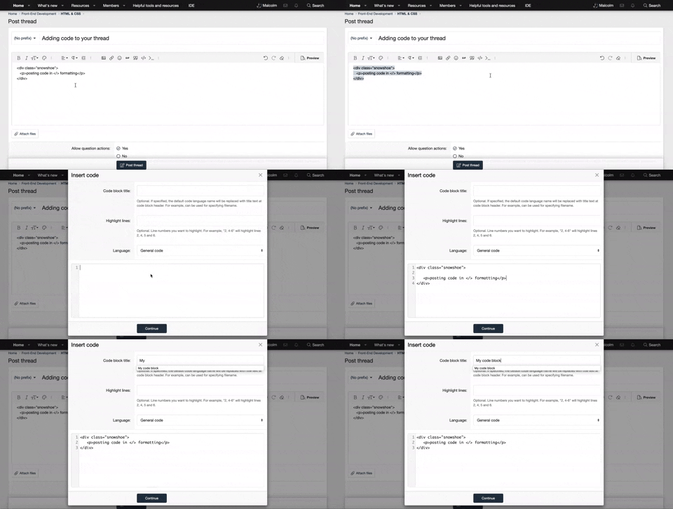
  • Guest, before posting your code please take these rules into consideration:
    • It is required to use our BBCode feature to display your code. While within the editor click < / > or >_ and place your code within the BB Code prompt. This helps others with finding a solution by making it easier to read and easier to copy.
    • You can also use markdown to share your code. When using markdown your code will be automatically converted to BBCode. For help with markdown check out the markdown guide.
    • Don't share a wall of code. All we want is the problem area, the code related to your issue.


    To learn more about how to use our BBCode feature, please click here.

    Thank you, Code Forum.

CSS Help with Media CSS on Footer

I am using this footer (well, I modified it quite a bit but liked the style here) and only after did I realize it has no media/responsive code in it.

Could anyone modify it to work on media screens as well. I have no clue how to go about this. I tried but failed.

Hey there,

What I suggest is using @media, with this you will be able to set the different style properties based on the different screen widths. An example of how this may look like:

CSS:
@media screen and (min-width: 900px) {
  p {
    color: red;
  }
}

With this code, you are specifying that if the screen size is bigger than 900px then change the paragraph element to red. So you can use this to your advantage in adjusting the different containers to fit on smaller screens.

For more information check out MDN web docs by clicking here.
 
Last edited:
Hey there,

What I suggest is using @media, with this you will be able to set the different style properties based on the different screen widths. An example of how this may look like:

CSS:
@media screen and (min-width: 900px) {
  p {
    color: red;
  }
}

With this code, you are specifying that if the screen size is bigger than 900px then change the paragraph element to red. So you can use this to your advantage in adjusting the different containers to fit on smaller screens.

For more information check out MDN web docs by clicking here.

Hey thanks for the reply. Yes I know to use @media the issue is I am not good enough with CSS to be able to get this looking right. I tired and failed.
 
Back
Top Bottom