richarddunnebsc
Active Coder
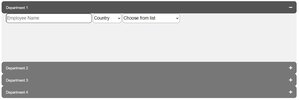
I have this

and this when Department 1 button is clicked
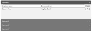
The CSS positioning is using absolute, however I want to change this to flex which I'm new at.
This is my CSS
this is how it renders
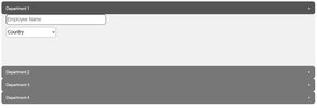
which is not the same obviously.
This is the HTML
and this when Department 1 button is clicked
The CSS positioning is using absolute, however I want to change this to flex which I'm new at.
This is my CSS
CSS:
#Departments{ margin: 10% 10% 10% 10%; }
.collapsible{margin: 0 0 0 0; width: 100%; height: 50px;}
.content{display: flex; height: 50px; width: 100%; flex-direction: row; justify-content: space-around;}
.name{height: 50px; width: 33%;}
.countries{height: 50px; width: 33%;}
this is how it renders
which is not the same obviously.
This is the HTML
HTML:
 <div id="Departments">
        <button type="button" class="collapsible">Department 1<span style="float: right;">+</span></button>
        <div class="content">
            <div class="name">
                <input type="text" name="Name" placeholder="Employee Name" style="width: 100%; ">
            </div>
            <div class="countries">
                <select name="Country" id="Country" style="width: 50%; ">
                    <option selected>Country</option>
                    <option>Australia</option>
                    <option>Canada</option>
                </select>
            </div>
        </div>
        <button type="button" class="collapsible">Department 2<span style="float: right;">+</span></button>
        <div class="content">
            <table>
                <tr>
                    <td style="width: 45%;">
                        <input type="text" name="Name" placeholder="Employee Name" style="width: 100%;">
                    </td>
                    <td style="width: 50%;">
                        <input type="email" name="Email" placeholder="Employee Email" style="width: 100%;">
                    </td>
                    <td style="width: 5%;">
                        <button type="submit" style="width: 100%;">Add</button>
                    </td>
                </tr>
            </table>
            <table>
                <tr>
                    <td style="width: 45%;">Employee Name</td>
                    <td style="width: 50%;">Employee Email</td>
                    <td style="width: 5%;">
                        <button type="submit" style="width: 100%;">X</button>
                    </td>
                </tr>
            </table>
        </div>
        <button type="button" class="collapsible">Department 3<span style="float: right;">+</span></button>
        <div class="content">
            <table>
                <tr>
                    <td style="width: 45%;">
                        <input type="text" name="Name" placeholder="Employee Name" style="width: 100%;">
                    </td>
                    <td style="width: 50%;">
                        <input type="email" name="Email" placeholder="Employee Email" style="width: 100%;">
                    </td>
                    <td style="width: 5%;">
                        <button type="submit" style="width: 100%;">Add</button>
                    </td>
                </tr>
            </table>
            <table>
                <tr>
                    <td style="width: 45%;">Employee Name</td>
                    <td style="width: 50%;">Employee Email</td>
                    <td style="width: 5%;">
                        <button type="submit" style="width: 100%;">X</button>
                    </td>
                </tr>
            </table>
        </div>
        <button type="button" class="collapsible">Department 4<span style="float: right;">+</span></button>
        <div class="content">
            <table>
                <tr>
                    <td style="width: 45%;">
                        <input type="text" name="Name" placeholder="Employee Name" style="width: 100%;">
                    </td>
                    <td style="width: 50%;">
                        <input type="email" name="Email" placeholder="Employee Email" style="width: 100%;">
                    </td>
                    <td style="width: 5%;">
                        <button type="submit" style="width: 100%;">Add</button>
                    </td>
                </tr>
            </table>
            <table>
                <tr>
                    <td style="width: 45%;">Employee Name</td>
                    <td style="width: 50%;">Employee Email</td>
                    <td style="width: 5%;">
                        <button type="submit" style="width: 100%;">X</button>
                    </td>
                </tr>
            </table>
        </div>

Any help appreciated.
    </div>