
Welcome to Code Forum!

Join a community that supports you and your coding journey from day one. We strive to be a friendly, supportive community that empowers everyone to be better developers. By registering with us, you'll be able to discuss, share and private message with other members of our community.

SignUp Now!
  • Guest, before posting your code please take these rules into consideration:
    • It is required to use our BBCode feature to display your code. While within the editor click < / > or >_ and place your code within the BB Code prompt. This helps others with finding a solution by making it easier to read and easier to copy.
    • You can also use markdown to share your code. When using markdown your code will be automatically converted to BBCode. For help with markdown check out the markdown guide.
    • Don't share a wall of code. All we want is the problem area, the code related to your issue.

    GIF shows where to locate </> in the thread and or post editor toolbar.
    To learn more about how to use our BBCode feature, review our "How to post your code into threads" here.

    Thank you, Code Forum.

CSS Row Height

Hello. This is probably a stupid question, but never the less, I´m stuck.
I´m trying to make a home page with a header, hero and footer.

I put them all in a continer with vh of 100. The header and footer fixed heights and look OK but the hero shrinks to the size of the font. I don´t have fixed size on the hero as I would like it to take up the remaining space. I would like it to push the footer all the way down to the bottom of the view port.

Hope you can help me.

Sincerely
Ronny


HTML
HTML:
<body>
<container>

        <div class="header"><h3>This is the header</h3></div>   

        <div class="hero"><h3>This is the hero</h3></div>

        <div class="footer"><h3>This is the footer</h3></div>

</container>

</body>
</html>

CSS
CSS:
.container{
    hight: 100vh;
}

.header{
    background-color: #005BFC;
    height: 35px;
}

.hero{
    background-color: #FB4C4F;
    height: 100%;
    
}
.footer{
    background-color: #63F97E;
    height: 250px;
}
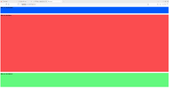
 
That why I said you may have to adjust the 100%. For my screen 97% done it. But everybody screen size is not the same.
Note: I don't know if this is a typo or not but, in your html you have <container>. Is this supposed to be a div with a container class?
Here the settings I have and what it looks like.

CSS:
html, body {
    height: 97%;
}

.container{
    height: 98vh;
}

.header{
    background-color: #005BFC;
    height: 8%;
}

.hero{
    background-color: #FB4C4F;
    height: 70%;
   
}
.footer{
    background-color: #63F97E;
    height: 17%;
}

html
HTML:
<!DOCTYPE html>
<html lang="en">
<head>
    <meta charset="UTF-8">
    <meta name="viewport" content="width=device-width, initial-scale=1.0">
    <link rel="stylesheet" href="style.css">
    <title>Document</title>
</head>


<body>
    <div class="container">
   
            <div class="header"><h3>This is the header</h3></div>  
   
            <div class="hero"><h3>This is the hero</h3></div>
   
            <div class="footer"><h3>This is the footer</h3></div>
   
    </div>
   
    </body>
    </html>
   
   
</html>
 

Attachments

  • Kazam_screenshot_00000.png
    Kazam_screenshot_00000.png
    37.7 KB · Views: 3
Last edited:
Thanks for the reply.

Supposed to be <div class="container"> Thanks.

What I´m trying to do is to give the header a fixed height of 35px and the footer a fixed height of 250px.
I would then like the footer to align with the bottom of the browser view port and have the hero fill watheves space is left no matter the browser size. Untill I start scrolling that is.

In other words I would like the hero size to be responsive and the rest fixed.
 
I don't know if you are restricted in what you can use, like really old browser compatibility or this being part of a lesson where you are only supposed to use what has been taught up to this point, but if you can use it then CSS Flexbox makes this easy to solve.


Code:
html, body {
    height: 100%;
    margin: 0;
    padding: 0;
}

.container {
    display: flex; /* Enable flexbox layout within this div, including child elements */
    flex-direction: column; /* Stack flex items vertically */
    min-height: 100vh; /* Use all available viewport height */
}

.header {
    background-color: #005BFC;
    height: 35px; /* Fixed height for the header */
}

.hero {
    background-color: #FB4C4F;
    flex-grow: 1; /* Expand to fill available space within the container div */
}

.footer {
    background-color: #63F97E;
    height: 250px; /* Fixed height for the footer */
}

CSS Flexbox isn't ideal for handling more complex website layouts, but it will work for a simple single column header/body/footer layout within a container div. If you plan on building out a more complex layout down the road, you might want to look at using CSS Grid. Flexbox is intended to be used for alignment while Grid is designed specifically to be used for layouts.
 
Thank you. I´ve looked into both grid and flexbox.
Is it possible to use both in the same layout? For instance, can I use what you wrote above and add a grid layout inside the hero?
You can use Grid in .hero while using Flex in .container. Using Flex in .container does not prevent you from using Grid in .hero.

Flex operates in 1 dimension. You are either managing a row or a column, not both. It is really good at adaptive sizing and wrapping.

Grid operates in 2 dimensions, both row and column at the same time. It is really good at managing complex layouts and precise placements, including intentional overlapping.

They are commonly used together. You won't be breaking any rules by choosing to use both on the same page.
 
Last edited:
You can use Grid in .hero while using Flex in .container. Using Flex in .container does not prevent you from using Grid in .hero.

Flex operates in 1 dimension. You are either managing a row or a column, not both. It is really good at adaptive sizing and wrapping.

Grid operates in 2 dimensions, both row and column at the same time. It is really good at managing complex layouts and precise placements, including intentional overlapping.

They are commonly used together. You won't be breaking any rules by choosing to use both on the same page.
Thank you so much for your help. This solved my problem and allso clarified grid vs flex for me!
 
Back
Top Bottom


