Welcome to Code Forum!

Join a community that supports you and your coding journey from day one. We strive to be a friendly, supportive community that empowers everyone to be better developers. By registering with us, you'll be able to discuss, share and private message with other members of our community.

SignUp Now!
  • Guest, before posting your code please take these rules into consideration:
    • It is required to use our BBCode feature to display your code. While within the editor click < / > or >_ and place your code within the BB Code prompt. This helps others with finding a solution by making it easier to read and easier to copy.
    • You can also use markdown to share your code. When using markdown your code will be automatically converted to BBCode. For help with markdown check out the markdown guide.
    • Don't share a wall of code. All we want is the problem area, the code related to your issue.

    GIF shows where to locate </> in the thread and or post editor toolbar.
    To learn more about how to use our BBCode feature, review our "How to post your code into threads" here.

    Thank you, Code Forum.

Collapsible Navbar

Edrol97

Silver Coder
Hi All, I'm wondering how to change my navbar code in order to have this kind of a set up.

To view this content we will need your consent to set third party cookies.
For more detailed information, see our cookies page.

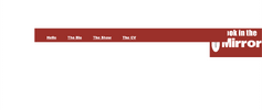
So far, I have something that looks like this:

I've set the z-index on the image to get it to the front but to no avail also.

Screenshot 2024-06-26 at 09.58.15.png
 
The example uses, I assume, position:sticky. This can be tricky to use. I am thinking they show a second navbar when it 'sticks' but I may be wrong. The items that will 'stick' must be in a specific structure where their direct parent element has the height to scroll. If you are that point, you may need to adjust z-index or at least positioning context of both image and navbar.

Hard to get specific without a link to examine.
 
The example uses, I assume, position:sticky. This can be tricky to use. I am thinking they show a second navbar when it 'sticks' but I may be wrong. The items that will 'stick' must be in a specific structure where their direct parent element has the height to scroll. If you are that point, you may need to adjust z-index or at least positioning context of both image and navbar.

Hard to get specific without a link to examine.
Here's the code if of any help.

HTML:
<!DOCTYPE html>
<html>
  <link rel="stylesheet" href="Mirror.css" />
  <link rel="script" href="Mirror.js" />
  <link rel="script" href="script.js" />
  <link
    rel="icon"
    type="image/x-icon"
    href="img/background/LookintheMirrorFavicon.png"
  />
  <body>
    <div id="headlogo" style="background-color: white">
      <img align="right" src="img/background/LookInTheMirror.png" width="20%" />
    </div>
    <div class="mirrornavbar">
      <a href="Home.html">Hi</a>
      <a href="about_me.html">Bio</a>
      <a href="Art.html">Show-Off</a>
      <a href="cv.html">The CV</a>
    </div>
  </body>
</html>

CSS:
body {
  opacity: 100%;
  font-family: Eliot Lord;
  font-size: 1.4dvw;
  margin: 0;
  user-select: none;
  -webkit-user-drag: none;
}
.mirrornavbar {
  font-family: "Times New Roman", Times, serif;
  background-color: #a92323;
  font-weight: 900;
  padding: 40px;
}
.mirrornavbar {
  margin: 200px 200px;
  height: 0px;
  background: #a92323;
  position: relative;
}
.headlogo {
  z-index: 4000000000000;
}
.header {
  color: #a92323;
  padding: 200px;
}
.mirrornavbar a {
  font-family: "Arial Black";
  color: white;
  padding: 30px 30px 50px;
}
body {
  opacity: 100%;
  font-family: Eliot Lord;
  font-size: 2.6dvh;
  font-weight: 900;
  margin: 0;
  user-select: none;
  -webkit-user-drag: none;
  cursor: url(img/background/cursors/Mouse%20cursor.png),
    url(img/background/cursors/pointer1.png), pointer;
}
a:hover,
img[onClick],
div[onclick] {
  cursor: url("img/background/cursors/pointer1.png"),
    url("img/background/cursors/Mouse%20cursor.png"),
    url("img/background/cursors/Finger%20cursor.png"), pointer;
}
 
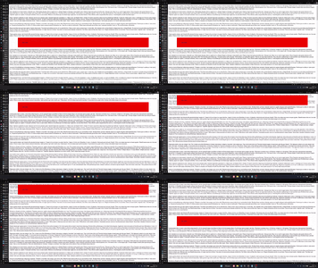
Use the top property to set the gap between the top of the page and the navigation bar, apply sticky positioning to the element, and set the z-index to a higher value than anything else on the page.

Example:
HTML:
<body>
  <p>content</p>
  <div class="nav">some links</div>
  <p>content</p>
</body>
CSS:
.nav {
  position: sticky;
  z-index: 10;
  top: 20px;
  left: 0;
  right: 0;
  margin: 0 100px;
  padding: 50px;
  background: red;
}
2024-06-2922-43-34-ezgif.com-optimize.gif
 

Buy us a coffee!

Buy me a coffee.
Back
Top Bottom