
Welcome to Code Forum!

Join a community that supports you and your coding journey from day one. We strive to be a friendly, supportive community that empowers everyone to be better developers. By registering with us, you'll be able to discuss, share and private message with other members of our community.

SignUp Now!
  • Guest, before posting your code please take these rules into consideration:
    • It is required to use our BBCode feature to display your code. While within the editor click < / > or >_ and place your code within the BB Code prompt. This helps others with finding a solution by making it easier to read and easier to copy.
    • You can also use markdown to share your code. When using markdown your code will be automatically converted to BBCode. For help with markdown check out the markdown guide.
    • Don't share a wall of code. All we want is the problem area, the code related to your issue.

    GIF shows where to locate </> in the thread and or post editor toolbar.
    To learn more about how to use our BBCode feature, review our "How to post your code into threads" here.

    Thank you, Code Forum.

Column lines?

Edrol97

Silver Coder
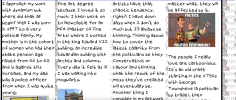
Hi all, wondering how to create lines between columns of text. I currently have this, but want the lines between the text as well. Do I need to specify new coordinates to shift additional lines over.

This is my current code for the lines in question. I also have tried adding styling of divs to create the lines, but wonder if there's a better way than having loads of divs.
CSS:
.content-box{
    border-left: 8px solid black;
    border-right: 8px solid black;
}


Screenshot 2024-04-29 at 11.20.48.png
 
Solution
CSS:
footer{
    position: relative;
    bottom: 20px;
}
.title_text1{
    font-family: Eliot Lord;
    font-size: 30pt;
}
.content-box{
    columns: 4 auto;
    max-width: 1400px;
    border-left: 8px solid black;
    border-right: 8px solid black;
}
.content-box a{
    font-size: 18pt;
}
.column:not(:last-child) {
    border-right: 1px solid black;
  }
h4{
    font-family: Times;
    font-size: 30pt;
}
@media only screen and (max-width: 768px) {
    b {
      font-size: 20pt;
    }
  }
 
  @media only screen and (max-width: 320px) {
    b {
      font-size: 10pt;
    }
  }
.vertical {
    border-left: 8px solid black;
    height: 300px;
    position:relative;
    left: 23%;
    bottom: 295px;
  }
  .content-box1{
    columns: 2...
You could either have one element with a background color and all others not occupying space so it shows or you could have an element with a background color and have it height you want like top at top bottom at bottom of your layout and a specified width for your lines. Maybe like inline style and a div for a column and like each is a percent of width and so are lines like say 23% for divs and 2% lines. To make things easy you could just make an outline right and left for your divs in specified colors. You could specify colors and styles. X E.
 
You could either have one element with a background color and all others not occupying space so it shows or you could have an element with a background color and have it height you want like top at top bottom at bottom of your layout and a specified width for your lines. Maybe like inline style and a div for a column and like each is a percent of width and so are lines like say 23% for divs and 2% lines. To make things easy you could just make an outline right and left for your divs in specified colors. You could specify colors and styles. X E.
This has gone a bit over my head after a day of work. Can you dumb it down slightly?
 
How are you achieving the columns shown?
CSS:
footer{
    position: relative;
    bottom: 20px;
}
.title_text1{
    font-family: Eliot Lord;
    font-size: 30pt;
}
.content-box{
    columns: 4 auto;
    max-width: 1400px;
    border-left: 8px solid black;
    border-right: 8px solid black;
}

.content-box a{
    font-size: 18pt;
}
.column:not(:last-child) {
    border-right: 1px solid black;
  }
h4{
    font-family: Times;
    font-size: 30pt;
}
@media only screen and (max-width: 768px) {
    b {
      font-size: 20pt;
    }
  }
  
  @media only screen and (max-width: 320px) {
    b {
      font-size: 10pt;
    }
  }
.vertical {
    border-left: 8px solid black;
    height: 300px;
    position:relative;
    left: 23%;
    bottom: 295px;
  }
  .content-box1{
    columns: 2;
    max-width: 1400px;
  }
  }

This is what I have on it in my CSS.
 
CSS:
footer{
    position: relative;
    bottom: 20px;
}
.title_text1{
    font-family: Eliot Lord;
    font-size: 30pt;
}
.content-box{
    columns: 4 auto;
    max-width: 1400px;
    border-left: 8px solid black;
    border-right: 8px solid black;
}
.content-box a{
    font-size: 18pt;
}
.column:not(:last-child) {
    border-right: 1px solid black;
  }
h4{
    font-family: Times;
    font-size: 30pt;
}
@media only screen and (max-width: 768px) {
    b {
      font-size: 20pt;
    }
  }
 
  @media only screen and (max-width: 320px) {
    b {
      font-size: 10pt;
    }
  }
.vertical {
    border-left: 8px solid black;
    height: 300px;
    position:relative;
    left: 23%;
    bottom: 295px;
  }
  .content-box1{
    columns: 2;
    max-width: 1400px;
  }
  }

This is what I have on it in my CSS.


I am guessing .content-box with columns: 4 is what is giving you your columns.

A quick google search turned up the following:

column-gap: 40px;
column-rule: 1px solid #000;

Here is some more info on that:
 
Solution
I am guessing .content-box with columns: 4 is what is giving you your columns.

A quick google search turned up the following:

column-gap: 40px;
column-rule: 1px solid #000;

Here is some more info on that:
Thanks- Problem solved. It's looking good now.
 

Buy us a coffee!

Buy me a coffee.
Back
Top Bottom


