

Valakik
New Coder
Hello
I don't know how I should make the design that the buttons will be equal line and not that one button will be below than other buttons.
My code is this:
I did attach the screenshot:
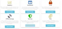
I use the bootstrap 3.4.1 version. Is there a solution that the page will recognize in that 6 cards, which has the most length and then put the all of the buttons similar level as the button which has most the text?
As you can see "offline settings" button is more below than the other buttons because above message is longer.
I did read d-flex method which I tried to use but didn't work for me.
Thank you in advance the answers.
I don't know how I should make the design that the buttons will be equal line and not that one button will be below than other buttons.
My code is this:
HTML:
<div class="row three__blocks text-center">
        <div class="container">
                <div class="card-deck mb-3 text-center">
            <div class="col-lg-4 col-md-3 mb-3">
                <div class="card mb-4 box-shadow">
                    <i class="card-img-top fas fa-chart-bar fa-5x" style="color: #e0d292;"></i>
                    <div class="card-header">
                        <h4 class="card-title">Statistics</h4>
                    </div>
                    <div class="card-body d-flex flex-column">
                        <p class="card-text smaller"><small>With our online dashboard and family app you'll be able to see how your children uses devices, apps, and the web. (coming soon)</small></p>
                    </div>
                    <div class="card-footer mt-auto">
                        <a class="btn btn-info btn-lg" href="index.html#" role="button">read more</a>
                    </div>
                </div>
            </div>
            <div class="col-lg-4 col-md-3 mb-3">
                <div class="card mb-4 box-shadow">
                    <i class="card-img-top fas fa-columns fa-5x" style="color: #4980bf;"></i>
                    <div class="card-header">
                        <h4 class="card-title">Dashboard</h4>
                    </div>
                    <div class="card-body d-flex flex-column">
                        <p class="card-text smaller"><small>You can manage via online dashboard your children's activity, time limit, add new parent member and children and much more with few clicks. (coming soon)</small></p>
                    </div>
                    <div class="card-footer mt-auto">
                        <a class="btn btn-info btn-lg" href="index.html#" role="button">read more</a>
                    </div>
                </div>
            </div>

            <div class="col-lg-4 col-md-3 mb-3">
                <div class="card mb-4 box-shadow">
                    <i class="card-img-top fas fa-lock fa-5x" style="color: #ba4914;"></i>
                    <div class="card-header">
                        <h4 class="card-title">Limit</h4>
                    </div>
                    <div class="card-body d-flex flex-column">
                        <p class="card-text smaller"><small>You can limit how much can be used the devices by your children and which applications they can use in specific time or block them completely.</small></p>
                    </div>
                    <div class="card-footer mt-auto">
                        <a class="btn btn-info btn-lg" href="index.html#" role="button">read more</a>
                    </div>
                </div>
            </div>
            <div class="col-lg-4 col-md-3 mb-3">
                <div class="card mb-4 box-shadow">
                    <i class="card-img-top fas fa-satellite-dish fa-5x" style="color: #626475;"></i>
                    <div class="card-header">
                        <h4 class="card-title">Offline settings</h4>
                    </div>
                    <div class="card-body d-flex flex-column flex-md-row">
                        <p class="card-text smaller"><small>If there is no internet connection then you as parent can give a master pin code to manage your children's activities. Later you can connect to your account the device when there is internet.</small></p>
                    </div>
                    <div class="card-footer mt-auto">
                        <a class="btn btn-info btn-lg" href="index.html#" role="button">read more</a>
                    </div>
                </div>
            </div>
            <div class="col-lg-4 col-md-3 mb-3">
                <div class="card mb-4 box-shadow">
                    <i class="card-img-top fas fa-shield-alt fa-5x" style="color: #27ba14;"></i>
                    <div class="card-header">
                        <h4 class="card-title">Security</h4>
                    </div>
                    <div class="card-body d-flex flex-column flex-md-row">
                        <p class="card-text smaller"><small>Make your children's online session secured so they will not going to dangerous places and talking with dangerous people. (coming soon)</small></p>
                    </div>
                    <div class="card-footer mt-auto">
                        <a class="btn btn-info btn-lg" href="index.html#" role="button">read more</a>
                    </div>
                </div>
            </div>
            <div class="col-lg-4 col-md-3 mb-3">
                <div class="card mb-4 box-shadow">
                    <i class="card-img-top fas fa-coins fa-5x" style="color: #e0d292;"></i>
                    <div class="card-header">
                        <h4 class="card-title">Free</h4>
                    </div>
                    <div class="card-body d-flex flex-column">
                        <p class="card-text smaller"><small>This service of IDU Network will staying free much as possible to give opportunity for everybody to use full potential of all the functions.</small></p>
                    </div>
                    <div class="card-footer mt-auto">
                        <a class="btn btn-info btn-lg" href="index.html#" role="button">read more</a>
                    </div>
                </div>
            </div>
        </div>
        </div>
    </div>
I did attach the screenshot:
I use the bootstrap 3.4.1 version. Is there a solution that the page will recognize in that 6 cards, which has the most length and then put the all of the buttons similar level as the button which has most the text?
As you can see "offline settings" button is more below than the other buttons because above message is longer.
I did read d-flex method which I tried to use but didn't work for me.
Thank you in advance the answers.






