

MJ1710
New Coder
Hi!
I'm trying to create a photography website but I've come across a problem I don't know how to fix.
I want to create a pop-up at the bottom of my website when I click on a specific photo.
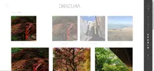
Beneath you can find two pictures.
The picture on the left is my website this far.
The picture on the right is the pop-up I'm trying to get (but then at the bottom of the page).
(I've posted the whole code, because I'm guessing the problem is because of my current code but I can't seem to find it).
Thanks a lot for your help!

My HTML code is:
[CODE lang="html" title="Html"]<!doctype html>
<html lang="nl">
<head>
<meta charset="utf-8">
<title>Homepagina</title>
<meta name="description" content="Homepagina">
<link rel="stylesheet" href="https://maxcdn.bootstrapcdn.com/bootstrap/4.0.0/css/bootstrap.min.css" integrity="sha384-Gn5384xqQ1aoWXA+058RXPxPg6fy4IWvTNh0E263XmFcJlSAwiGgFAW/dAiS6JXm" crossorigin="anonymous">
<link rel="stylesheet" href="C:\Users\marin\Downloads\Uitwerking\Uitwerking\css\studiotwee.css">
</head>
<body>
<header class ="headertwo">
<a href="https://www.google.com">
<img class="terug" src="C:\Users\marin\Documents\avans\leerjaar2\Blok 6\mdev\group 39.png" alt="terug">
</a>
<div>
<p id="titel">OBSCURA</p>
</div>
</header>
<div class="largenavigation">
<ul>
<a href="https://www.google.com">
<li><a1 href="homepagina.html" rel="homepagina.css">H</a1></li>
<li><a1 href="homepagina.html" rel="homepagina.css">O</a1></li>
<li><a1 href="homepagina.html" rel="homepagina.css">M</a1></li>
<li><a1 href="homepagina.html" rel="homepagina.css">E</a1></li>
</a>
</ul>
<ul>
<a href="https://www.google.com">
<li><a2 href="searchpagina.html" rel="searchpagina.css">S</a2></li>
<li><a2 href="searchpagina.html" rel="searchpagina.css">E</a2></li>
<li><a2 href="searchpagina.html" rel="searchpagina.css">A</a2></li>
<li><a2 href="searchpagina.html" rel="searchpagina.css">R</a2></li>
<li><a2 href="searchpagina.html" rel="searchpagina.css">C</a2></li>
<li><a2 href="searchpagina.html" rel="searchpagina.css">H</a2></li>
</a>
</ul>
<ul>
<a href="https://www.google.com">
<li><a3 href="studiopagina.html" rel="studiopagina.css">S</a3></li>
<li><a3 href="studiopagina.html" rel="studiopagina.css">T</a3></li>
<li><a3 href="studiopagina.html" rel="studiopagina.css">U</a3></li>
<li><a3 href="studiopagina.html" rel="studiopagina.css">D</a3></li>
<li><a3 href="studiopagina.html" rel="studiopagina.css">I</a3></li>
<li><a3 href="studiopagina.html" rel="studiopagina.css">O</a3></li>
</a>
</ul>
<ul>
<a href="https://www.google.com">
<li><a4 href="profielpagina.html" rel="profielpagina.css">P</a4></li>
<li><a4 href="profielpagina.html" rel="profielpagina.css">R</a4></li>
<li><a4 href="profielpagina.html" rel="profielpagina.css">O</a4></li>
<li><a4 href="profielpagina.html" rel="profielpagina.css">F</a4></li>
<li><a4 href="profielpagina.html" rel="profielpagina.css">I</a4></li>
<li><a4 href="profielpagina.html" rel="profielpagina.css">L</a4></li>
<li><a4 href="profielpagina.html" rel="profielpagina.css">E</a4></li>
</a>
</ul>
</div>
<div class="topnav">
<ul class="headertext">
<a href="https://www.google.com">
<a class = "a1" href="homepagina.html" rel="homepagina.css">HOME</a>
</a>
<a href="https://www.google.com">
<a class = "a2" href="searchpagina.html" rel="searchpagina.css">SEARCH</a>
</a>
<a href="https://www.google.com">
<a class = "a3" href="studiopagina.html" rel="studiopagina.css">STUDIO</a>
</a>
<a href="https://www.google.com">
<a class = "a4" href="profielpagina.html" rel="profielpagina.css">PROFILE</a>
</a>
</ul>
</div>
<!-- The Modal -->
<div id="myModal" class="modal">
<!-- Modal content -->
<div class="modal-content">
<span class="close">×</span>
<p>Import (1)</p>
</div>
</div>
<div class="ondertitel"> Camera Roll </div>
<div class="galleryeen">
<div class="boxnul"><img src="C:\Users\marin\Pictures\css afbeeldingen\hague1.jpg" alt="eigen afbeelding" style = "width: 100%; height: 100%;"><div class="ondertiteleen"> All </div></div>
<div class="boxeen"><img src="C:\Users\marin\Pictures\css afbeeldingen\hague1.jpg" alt="eigen afbeelding" style = "width: 100%; height: 100%;"><div class="ondertiteltwee"> Recents </div></div>
<div class="boxtwee"><img src="C:\Users\marin\Pictures\css afbeeldingen\nijmegen.jpg" alt="eigen afbeelding" style = "width: 100%; height: 100%;"><div class="ondertiteltwee"> Favorites </div></div>
<div class="boxdrie"><img src="C:\Users\marin\Pictures\css afbeeldingen\france.jpg" alt="eigen afbeelding" style = "width: 100%; height: 100%;"><div class="ondertiteltwee"> France </div></div>
</div>
<div class="gallerytwee">
<div class="boxvier" id="myBtn" ><img src="C:\Users\marin\Pictures\css afbeeldingen\hague1.jpg" alt="eigen afbeelding" style = "width: 100%; height: 100%;"></div>
<div class="boxvijf"><img src="C:\Users\marin\Pictures\css afbeeldingen\hague2.jpg" alt="eigen afbeelding" style = "width: 100%; height: 100%;"></div>
<div class="boxzes"><img src="C:\Users\marin\Pictures\css afbeeldingen\hague3.jpg" alt="eigen afbeelding" style = "width: 100%; height: 100%;"></div>
<div class="boxvier"><img src="C:\Users\marin\Pictures\css afbeeldingen\hague4.jpg" alt="eigen afbeelding" style = "width: 100%; height: 100%;"></div>
<div class="boxvijf"><img src="C:\Users\marin\Pictures\css afbeeldingen\hague5.jpg" alt="eigen afbeelding" style = "width: 100%; height: 100%;"></div>
<div class="boxzes"><img src="C:\Users\marin\Pictures\css afbeeldingen\hague6.jpg" alt="eigen afbeelding" style = "width: 100%; height: 100%;"></div>
<div class="boxvier"><img src="C:\Users\marin\Pictures\css afbeeldingen\hague7.jpg" alt="eigen afbeelding" style = "width: 100%; height: 100%;"></div>
<div class="boxvijf"><img src="C:\Users\marin\Pictures\css afbeeldingen\hague8.jpg" alt="eigen afbeelding" style = "width: 100%; height: 100%;"></div>
<div class="boxzes"><img src="C:\Users\marin\Pictures\css afbeeldingen\hague9.jpg" alt="eigen afbeelding" style = "width: 100%; height: 100%;"></div>
</div>
<script>
// Get the modal
var modal = document.getElementById("myModal");
// Get the button that opens the modal
var btn = document.getElementById("myBtn");
// Get the <span> element that closes the modal
var span = document.getElementsByClassName("close")[0];
// When the user clicks the button, open the modal
btn.onclick = function() {
modal.style.display = "block";
}
// When the user clicks on <span> (x), close the modal
span.onclick = function() {
modal.style.display = "none";
}
// When the user clicks anywhere outside of the modal, close it
window.onclick = function(event) {
    if (event.target == modal) {
        modal.style.display = "none";
    }
}
</script>
</body>
</html>
[/CODE]
My CSS code is:
[CODE lang="css" title="CSS"]/* On screens that are 600px wide or less, make the menu links stack on top of each other instead of next to each other */
@media screen and (min-width: 1470px) {
.largenavigation{
background:#404040;
top:0;
bottom:0;
margin-top: 0px;
margin-left: 1435px;
height:100%;
width: 60px;
display: table;
position: fixed;
}
.terug{
margin-top: 30px;
margin-bottom: 20px;
margin-left: 50px;
height:50px;
width:40px;
}
.topnav {
display: none;
}
#titel{
width: 1000px;
margin-top: -80px;
margin-left: -200px;
font-family: 'Exo 2', sans-serif;
font-size: 50px;
text-align: right;
}
.boxnul {
background-color: #32a852;
max-height: 250px;
width: 70%;
margin-left: 100px;
grid-gap: 4rem;
padding: 0rem;
}
.boxeen {
background-color: #32a852;
max-height: 250px;
margin-left: 150px;
width: 70%;
grid-gap: 0rem;
padding: 0rem;
opacity: 50%;
}
.boxtwee {
background-color: #32a852;
max-height: 250px;
margin-left: 65px;
width: 70%;
grid-gap: 0rem;
padding: 0rem;
opacity: 50%;
}
.boxdrie {
background-color: #32a852;
max-height: 250px;
margin-left: -20px;
width: 70%;
grid-gap: 0rem;
padding: 0rem;
opacity: 50%;
}
.boxvier {
margin-top: 50px;
background-color: #32a852;
max-height: 400px;
width: 80%;
margin-left: 85px;
}
.boxvijf {
margin-top: 50px;
background-color: #32a852;
max-height: 400px;
margin-left: 30px;
width: 80%;
}
.boxzes {
margin-top: 50px;
background-color: #32a852;
max-height: 400px;
width: 80%;
margin-left: -20px;
}
.galleryeen{
margin-left: 10px;
display: grid;
grid-template-columns: repeat(auto-fit, minmax(270px, 1fr));
grid-auto-flow: dense;
width: 95%
}
.gallerytwee{
margin-left: 10px;
display: grid;
grid-template-columns: repeat(auto-fit, minmax(400px, 1fr));
grid-gap: 0rem;
grid-auto-flow: dense;
padding: 1rem;
width: 95%
}
*{
margin: 0;
padding: 0;
box-sizing: border-box;
}
.ondertitel {
margin-left: 110px;
margin-bottom: 20px;
font-family: 'Exo 2', sans-serif;
font-size: 20px;
}
.ondertiteleen {
margin-top: 10px;
margin-left: 100px;
font-family: 'Exo 2', sans-serif;
font-size: 20px;
}
.ondertiteltwee {
margin-top: 10px;
margin-left: 90px;
font-family: 'Exo 2', sans-serif;
font-size: 20px;
}
/* The Modal (background) */
.modal {
display: none; /* Hidden by default */
position: fixed; /* Stay in place */
z-index: 1; /* Sit on top */
padding-top: 100px; /* Location of the box */
left: 0;
top: 0;
width: 100%; /* Full width */
height: 100%; /* Full height */
overflow: auto; /* Enable scroll if needed */
}
/* Modal Content */
.modal-content {
background-color: black;
opacity: 70%;
margin: auto;
padding: 20px;
border: 1px solid #888;
width: 100%;
}
/* The Close Button */
.close {
color: white;
float: right;
font-size: 28px;
font-weight: bold;
}
.close:hover,
.close:focus {
color: white;
text-decoration: none;
cursor: pointer;
}
p {
color: white;
font-family: 'Exo 2', sans-serif;
font-size: 20px;
margin-left: 700px;
}
}
@media (min-width: 730px) and (max-width: 1470px) {
.largenavigation {
display: none;
}
.topnav {
position: fixed;
left: 0;
bottom: 0;
width: 100%;
text-align: center;
}
.terug{
margin-top: 30px;
margin-bottom: 20px;
margin-left: 50px;
height:50px;
width:40px;
}
#titel{
width: 1000px;
margin-top: -60px;
margin-left: 500px;
font-family: 'Exo 2', sans-serif;
font-size: 30px;
}
.boxnul {
background-color: #32a852;
max-height: 250px;
width: 70%;
margin-left: 50px;
grid-gap: 4rem;
padding: 0rem;
}
.boxeen {
background-color: #32a852;
max-height: 250px;
margin-left: 100px;
width: 70%;
grid-gap: 0rem;
padding: 0rem;
opacity: 50%;
}
.boxtwee {
background-color: #32a852;
max-height: 250px;
margin-left: 60px;
width: 70%;
grid-gap: 0rem;
padding: 0rem;
opacity: 50%;
}
.boxdrie {
background-color: #32a852;
max-height: 250px;
margin-left: 20px;
width: 70%;
grid-gap: 0rem;
padding: 0rem;
opacity: 50%;
}
.boxvier {
margin-top: 50px;
background-color: #32a852;
max-height: 400px;
width: 80%;
margin-left: 35px;
}
.boxvijf {
margin-top: 50px;
background-color: #32a852;
max-height: 400px;
margin-left: 30px;
width: 80%;
}
.boxzes {
margin-top: 50px;
background-color: #32a852;
max-height: 400px;
width: 80%;
margin-left: 25px;
}
.galleryeen{
margin-left: 10px;
display: grid;
grid-template-columns: repeat(auto-fit, minmax(150px, 1fr));
grid-auto-flow: dense;
width: 95%
}
.gallerytwee{
margin-left: 10px;
display: grid;
grid-template-columns: repeat(auto-fit, minmax(350px, 1fr));
grid-gap: 0rem;
grid-auto-flow: dense;
padding: 1rem;
width: 95%
}
*{
margin: 0;
padding: 0;
box-sizing: border-box;
}
.ondertitel {
margin-left: 110px;
margin-bottom: 20px;
font-family: 'Exo 2', sans-serif;
font-size: 20px;
}
.ondertiteleen {
margin-top: 10px;
margin-left: 80px;
font-family: 'Exo 2', sans-serif;
font-size: 20px;
}
.ondertiteltwee {
margin-top: 10px;
margin-left: 60px;
font-family: 'Exo 2', sans-serif;
font-size: 20px;
}
}
@media (min-width: 0px) and (max-width: 730px) {
.largenavigation {
display: none;
}
.topnav {
position: fixed;
left: 0;
bottom: 0;
width: 100%;
text-align: center;
}
.terug{
margin-top: 30px;
margin-bottom: 20px;
margin-left: 50px;
height:30px;
width:20px;
}
#titel{
width: 1000px;
margin-top: -60px;
margin-left: 250px;
font-family: 'Exo 2', sans-serif;
font-size: 20px;
}
.boxnul {
background-color: #32a852;
max-height: 100px;
width: 70%;
margin-left: 40px;
grid-gap: 4rem;
padding: 0rem;
}
.boxeen {
background-color: #32a852;
max-height: 100px;
margin-left: 50px;
width: 70%;
grid-gap: 0rem;
padding: 0rem;
opacity: 50%;
}
.boxtwee {
background-color: #32a852;
max-height: 100px;
margin-left: 25px;
width: 70%;
grid-gap: 0rem;
padding: 0rem;
opacity: 50%;
}
.boxdrie {
background-color: #32a852;
max-height: 100px;
margin-left: 0px;
width: 70%;
grid-gap: 0rem;
padding: 0rem;
opacity: 50%;
}
.boxvier {
margin-top: 40px;
background-color: #32a852;
max-height: 400px;
width: 80%;
margin-left: 25px;
}
.boxvijf {
margin-top: 40px;
background-color: #32a852;
max-height: 400px;
margin-left: 20px;
width: 80%;
}
.boxzes {
margin-top: 40px;
background-color: #32a852;
max-height: 400px;
width: 80%;
margin-left: 10px;
}
.galleryeen{
margin-left: 10px;
display: grid;
grid-template-columns: repeat(auto-fit, minmax(110px, 1fr));
grid-auto-flow: dense;
width: 95%
}
.gallerytwee{
margin-left: 10px;
display: grid;
grid-template-columns: repeat(auto-fit, minmax(140px, 1fr));
grid-gap: 0rem;
grid-auto-flow: dense;
padding: 1rem;
width: 95%
}
*{
margin: 0;
padding: 0;
box-sizing: border-box;
}
.ondertitel {
margin-top: 20px;
margin-left: 240px;
margin-bottom: 20px;
font-family: 'Exo 2', sans-serif;
font-size: 20px;
}
.ondertiteleen {
margin-top: 10px;
margin-left: 30px;
font-family: 'Exo 2', sans-serif;
font-size: 15px;
}
.ondertiteltwee {
margin-top: 10px;
margin-left: 10px;
font-family: 'Exo 2', sans-serif;
font-size: 15px;
}
}
.headertext {
display: flex;
justify-content: center;
position: absolute;
bottom: 0;
width: 100%;
margin-bottom: 0px;
}
.a1 {
color: white;
padding: 10px;
width: 100%;
text-decoration: none;
font-family: 'Exo 2', sans-serif;
font-size: 20px;
}
.a2 {
color: white;
padding: 10px;
width: 100%;
text-decoration: none;
font-family: 'Exo 2', sans-serif;
font-size: 20px;
line-height: 20px;
}
.a3 {
font-weight: 900;
color: white;
padding: 10px;
width: 100%;
text-decoration: none;
font-family: 'Exo 2', sans-serif;
font-size: 20px;
line-height: 20px;
}
.a4 {
color: white;
padding: 10px;
width: 100%;
text-decoration: none;
font-family: 'Exo 2', sans-serif;
font-size: 20px;
line-height: 20px;
}
p{
color:#000;
}
a{
text-decoration: none;
color:#000000;
font-family:sans-serif;
text-transform: uppercase;
}
body {
overflow-x: hidden;
}
ul {
list-style-type: none;
margin: 0px;
padding: 20px;
overflow: hidden;
background-color: #404040;
margin-bottom: -15px;
}
li {
float: center;
}
li a1 {
color: white;
padding: 15px;
width: 10px;
text-decoration: none;
font-family: 'Exo 2', sans-serif;
font-size: 20px;
line-height: 24px;
}
li a2 {
color: white;
padding: 15px;
width: 10px;
text-decoration: none;
font-family: 'Exo 2', sans-serif;
font-size: 20px;
line-height: 24px;
}
li a3 {
font-weight: 900;
color: white;
padding: 15px;
width: 10px;
text-decoration: none;
font-family: 'Exo 2', sans-serif;
font-size: 20px;
line-height: 24px;
}
li a4 {
color: white;
padding: 15px;
width: 10px;
text-decoration: none;
font-family: 'Exo 2', sans-serif;
font-size: 20px;
line-height: 24px;
}
article{
padding:20px 0 20px 0;
}
a{
text-decoration: none;
color:#000000;
font-family:sans-serif;
text-transform: uppercase;
}
.section-cta{
background-color:#7a8891;
padding:200px 0 200px 0;
}
.cta{
background-color:#c20156;
text-align: center;
display: block;
padding:20px;
width:200px;
margin:0 auto;
}
body {
overflow-x: hidden;
}
nav{
background:#404040;
position:absolute;
top:0;
bottom:0;
right:20px;
height:100%;
width: 60px;
display: table;
}
.foto1 {
width: 180px;
height: 250px;
}
[/CODE]
I'm trying to create a photography website but I've come across a problem I don't know how to fix.
I want to create a pop-up at the bottom of my website when I click on a specific photo.
Beneath you can find two pictures.
The picture on the left is my website this far.
The picture on the right is the pop-up I'm trying to get (but then at the bottom of the page).
(I've posted the whole code, because I'm guessing the problem is because of my current code but I can't seem to find it).
Thanks a lot for your help!
My HTML code is:
[CODE lang="html" title="Html"]<!doctype html>
<html lang="nl">
<head>
<meta charset="utf-8">
<title>Homepagina</title>
<meta name="description" content="Homepagina">
<link rel="stylesheet" href="https://maxcdn.bootstrapcdn.com/bootstrap/4.0.0/css/bootstrap.min.css" integrity="sha384-Gn5384xqQ1aoWXA+058RXPxPg6fy4IWvTNh0E263XmFcJlSAwiGgFAW/dAiS6JXm" crossorigin="anonymous">
<link rel="stylesheet" href="C:\Users\marin\Downloads\Uitwerking\Uitwerking\css\studiotwee.css">
</head>
<body>
<header class ="headertwo">
<a href="https://www.google.com">
<img class="terug" src="C:\Users\marin\Documents\avans\leerjaar2\Blok 6\mdev\group 39.png" alt="terug">
</a>
<div>
<p id="titel">OBSCURA</p>
</div>
</header>
<div class="largenavigation">
<ul>
<a href="https://www.google.com">
<li><a1 href="homepagina.html" rel="homepagina.css">H</a1></li>
<li><a1 href="homepagina.html" rel="homepagina.css">O</a1></li>
<li><a1 href="homepagina.html" rel="homepagina.css">M</a1></li>
<li><a1 href="homepagina.html" rel="homepagina.css">E</a1></li>
</a>
</ul>
<ul>
<a href="https://www.google.com">
<li><a2 href="searchpagina.html" rel="searchpagina.css">S</a2></li>
<li><a2 href="searchpagina.html" rel="searchpagina.css">E</a2></li>
<li><a2 href="searchpagina.html" rel="searchpagina.css">A</a2></li>
<li><a2 href="searchpagina.html" rel="searchpagina.css">R</a2></li>
<li><a2 href="searchpagina.html" rel="searchpagina.css">C</a2></li>
<li><a2 href="searchpagina.html" rel="searchpagina.css">H</a2></li>
</a>
</ul>
<ul>
<a href="https://www.google.com">
<li><a3 href="studiopagina.html" rel="studiopagina.css">S</a3></li>
<li><a3 href="studiopagina.html" rel="studiopagina.css">T</a3></li>
<li><a3 href="studiopagina.html" rel="studiopagina.css">U</a3></li>
<li><a3 href="studiopagina.html" rel="studiopagina.css">D</a3></li>
<li><a3 href="studiopagina.html" rel="studiopagina.css">I</a3></li>
<li><a3 href="studiopagina.html" rel="studiopagina.css">O</a3></li>
</a>
</ul>
<ul>
<a href="https://www.google.com">
<li><a4 href="profielpagina.html" rel="profielpagina.css">P</a4></li>
<li><a4 href="profielpagina.html" rel="profielpagina.css">R</a4></li>
<li><a4 href="profielpagina.html" rel="profielpagina.css">O</a4></li>
<li><a4 href="profielpagina.html" rel="profielpagina.css">F</a4></li>
<li><a4 href="profielpagina.html" rel="profielpagina.css">I</a4></li>
<li><a4 href="profielpagina.html" rel="profielpagina.css">L</a4></li>
<li><a4 href="profielpagina.html" rel="profielpagina.css">E</a4></li>
</a>
</ul>
</div>
<div class="topnav">
<ul class="headertext">
<a href="https://www.google.com">
<a class = "a1" href="homepagina.html" rel="homepagina.css">HOME</a>
</a>
<a href="https://www.google.com">
<a class = "a2" href="searchpagina.html" rel="searchpagina.css">SEARCH</a>
</a>
<a href="https://www.google.com">
<a class = "a3" href="studiopagina.html" rel="studiopagina.css">STUDIO</a>
</a>
<a href="https://www.google.com">
<a class = "a4" href="profielpagina.html" rel="profielpagina.css">PROFILE</a>
</a>
</ul>
</div>
<!-- The Modal -->
<div id="myModal" class="modal">
<!-- Modal content -->
<div class="modal-content">
<span class="close">×</span>
<p>Import (1)</p>
</div>
</div>
<div class="ondertitel"> Camera Roll </div>
<div class="galleryeen">
<div class="boxnul"><img src="C:\Users\marin\Pictures\css afbeeldingen\hague1.jpg" alt="eigen afbeelding" style = "width: 100%; height: 100%;"><div class="ondertiteleen"> All </div></div>
<div class="boxeen"><img src="C:\Users\marin\Pictures\css afbeeldingen\hague1.jpg" alt="eigen afbeelding" style = "width: 100%; height: 100%;"><div class="ondertiteltwee"> Recents </div></div>
<div class="boxtwee"><img src="C:\Users\marin\Pictures\css afbeeldingen\nijmegen.jpg" alt="eigen afbeelding" style = "width: 100%; height: 100%;"><div class="ondertiteltwee"> Favorites </div></div>
<div class="boxdrie"><img src="C:\Users\marin\Pictures\css afbeeldingen\france.jpg" alt="eigen afbeelding" style = "width: 100%; height: 100%;"><div class="ondertiteltwee"> France </div></div>
</div>
<div class="gallerytwee">
<div class="boxvier" id="myBtn" ><img src="C:\Users\marin\Pictures\css afbeeldingen\hague1.jpg" alt="eigen afbeelding" style = "width: 100%; height: 100%;"></div>
<div class="boxvijf"><img src="C:\Users\marin\Pictures\css afbeeldingen\hague2.jpg" alt="eigen afbeelding" style = "width: 100%; height: 100%;"></div>
<div class="boxzes"><img src="C:\Users\marin\Pictures\css afbeeldingen\hague3.jpg" alt="eigen afbeelding" style = "width: 100%; height: 100%;"></div>
<div class="boxvier"><img src="C:\Users\marin\Pictures\css afbeeldingen\hague4.jpg" alt="eigen afbeelding" style = "width: 100%; height: 100%;"></div>
<div class="boxvijf"><img src="C:\Users\marin\Pictures\css afbeeldingen\hague5.jpg" alt="eigen afbeelding" style = "width: 100%; height: 100%;"></div>
<div class="boxzes"><img src="C:\Users\marin\Pictures\css afbeeldingen\hague6.jpg" alt="eigen afbeelding" style = "width: 100%; height: 100%;"></div>
<div class="boxvier"><img src="C:\Users\marin\Pictures\css afbeeldingen\hague7.jpg" alt="eigen afbeelding" style = "width: 100%; height: 100%;"></div>
<div class="boxvijf"><img src="C:\Users\marin\Pictures\css afbeeldingen\hague8.jpg" alt="eigen afbeelding" style = "width: 100%; height: 100%;"></div>
<div class="boxzes"><img src="C:\Users\marin\Pictures\css afbeeldingen\hague9.jpg" alt="eigen afbeelding" style = "width: 100%; height: 100%;"></div>
</div>
<script>
// Get the modal
var modal = document.getElementById("myModal");
// Get the button that opens the modal
var btn = document.getElementById("myBtn");
// Get the <span> element that closes the modal
var span = document.getElementsByClassName("close")[0];
// When the user clicks the button, open the modal
btn.onclick = function() {
modal.style.display = "block";
}
// When the user clicks on <span> (x), close the modal
span.onclick = function() {
modal.style.display = "none";
}
// When the user clicks anywhere outside of the modal, close it
window.onclick = function(event) {
if (event.target == modal) {
modal.style.display = "none";
}
}
</script>
</body>
</html>
[/CODE]
My CSS code is:
[CODE lang="css" title="CSS"]/* On screens that are 600px wide or less, make the menu links stack on top of each other instead of next to each other */
@media screen and (min-width: 1470px) {
.largenavigation{
background:#404040;
top:0;
bottom:0;
margin-top: 0px;
margin-left: 1435px;
height:100%;
width: 60px;
display: table;
position: fixed;
}
.terug{
margin-top: 30px;
margin-bottom: 20px;
margin-left: 50px;
height:50px;
width:40px;
}
.topnav {
display: none;
}
#titel{
width: 1000px;
margin-top: -80px;
margin-left: -200px;
font-family: 'Exo 2', sans-serif;
font-size: 50px;
text-align: right;
}
.boxnul {
background-color: #32a852;
max-height: 250px;
width: 70%;
margin-left: 100px;
grid-gap: 4rem;
padding: 0rem;
}
.boxeen {
background-color: #32a852;
max-height: 250px;
margin-left: 150px;
width: 70%;
grid-gap: 0rem;
padding: 0rem;
opacity: 50%;
}
.boxtwee {
background-color: #32a852;
max-height: 250px;
margin-left: 65px;
width: 70%;
grid-gap: 0rem;
padding: 0rem;
opacity: 50%;
}
.boxdrie {
background-color: #32a852;
max-height: 250px;
margin-left: -20px;
width: 70%;
grid-gap: 0rem;
padding: 0rem;
opacity: 50%;
}
.boxvier {
margin-top: 50px;
background-color: #32a852;
max-height: 400px;
width: 80%;
margin-left: 85px;
}
.boxvijf {
margin-top: 50px;
background-color: #32a852;
max-height: 400px;
margin-left: 30px;
width: 80%;
}
.boxzes {
margin-top: 50px;
background-color: #32a852;
max-height: 400px;
width: 80%;
margin-left: -20px;
}
.galleryeen{
margin-left: 10px;
display: grid;
grid-template-columns: repeat(auto-fit, minmax(270px, 1fr));
grid-auto-flow: dense;
width: 95%
}
.gallerytwee{
margin-left: 10px;
display: grid;
grid-template-columns: repeat(auto-fit, minmax(400px, 1fr));
grid-gap: 0rem;
grid-auto-flow: dense;
padding: 1rem;
width: 95%
}
*{
margin: 0;
padding: 0;
box-sizing: border-box;
}
.ondertitel {
margin-left: 110px;
margin-bottom: 20px;
font-family: 'Exo 2', sans-serif;
font-size: 20px;
}
.ondertiteleen {
margin-top: 10px;
margin-left: 100px;
font-family: 'Exo 2', sans-serif;
font-size: 20px;
}
.ondertiteltwee {
margin-top: 10px;
margin-left: 90px;
font-family: 'Exo 2', sans-serif;
font-size: 20px;
}
/* The Modal (background) */
.modal {
display: none; /* Hidden by default */
position: fixed; /* Stay in place */
z-index: 1; /* Sit on top */
padding-top: 100px; /* Location of the box */
left: 0;
top: 0;
width: 100%; /* Full width */
height: 100%; /* Full height */
overflow: auto; /* Enable scroll if needed */
}
/* Modal Content */
.modal-content {
background-color: black;
opacity: 70%;
margin: auto;
padding: 20px;
border: 1px solid #888;
width: 100%;
}
/* The Close Button */
.close {
color: white;
float: right;
font-size: 28px;
font-weight: bold;
}
.close:hover,
.close:focus {
color: white;
text-decoration: none;
cursor: pointer;
}
p {
color: white;
font-family: 'Exo 2', sans-serif;
font-size: 20px;
margin-left: 700px;
}
}
@media (min-width: 730px) and (max-width: 1470px) {
.largenavigation {
display: none;
}
.topnav {
position: fixed;
left: 0;
bottom: 0;
width: 100%;
text-align: center;
}
.terug{
margin-top: 30px;
margin-bottom: 20px;
margin-left: 50px;
height:50px;
width:40px;
}
#titel{
width: 1000px;
margin-top: -60px;
margin-left: 500px;
font-family: 'Exo 2', sans-serif;
font-size: 30px;
}
.boxnul {
background-color: #32a852;
max-height: 250px;
width: 70%;
margin-left: 50px;
grid-gap: 4rem;
padding: 0rem;
}
.boxeen {
background-color: #32a852;
max-height: 250px;
margin-left: 100px;
width: 70%;
grid-gap: 0rem;
padding: 0rem;
opacity: 50%;
}
.boxtwee {
background-color: #32a852;
max-height: 250px;
margin-left: 60px;
width: 70%;
grid-gap: 0rem;
padding: 0rem;
opacity: 50%;
}
.boxdrie {
background-color: #32a852;
max-height: 250px;
margin-left: 20px;
width: 70%;
grid-gap: 0rem;
padding: 0rem;
opacity: 50%;
}
.boxvier {
margin-top: 50px;
background-color: #32a852;
max-height: 400px;
width: 80%;
margin-left: 35px;
}
.boxvijf {
margin-top: 50px;
background-color: #32a852;
max-height: 400px;
margin-left: 30px;
width: 80%;
}
.boxzes {
margin-top: 50px;
background-color: #32a852;
max-height: 400px;
width: 80%;
margin-left: 25px;
}
.galleryeen{
margin-left: 10px;
display: grid;
grid-template-columns: repeat(auto-fit, minmax(150px, 1fr));
grid-auto-flow: dense;
width: 95%
}
.gallerytwee{
margin-left: 10px;
display: grid;
grid-template-columns: repeat(auto-fit, minmax(350px, 1fr));
grid-gap: 0rem;
grid-auto-flow: dense;
padding: 1rem;
width: 95%
}
*{
margin: 0;
padding: 0;
box-sizing: border-box;
}
.ondertitel {
margin-left: 110px;
margin-bottom: 20px;
font-family: 'Exo 2', sans-serif;
font-size: 20px;
}
.ondertiteleen {
margin-top: 10px;
margin-left: 80px;
font-family: 'Exo 2', sans-serif;
font-size: 20px;
}
.ondertiteltwee {
margin-top: 10px;
margin-left: 60px;
font-family: 'Exo 2', sans-serif;
font-size: 20px;
}
}
@media (min-width: 0px) and (max-width: 730px) {
.largenavigation {
display: none;
}
.topnav {
position: fixed;
left: 0;
bottom: 0;
width: 100%;
text-align: center;
}
.terug{
margin-top: 30px;
margin-bottom: 20px;
margin-left: 50px;
height:30px;
width:20px;
}
#titel{
width: 1000px;
margin-top: -60px;
margin-left: 250px;
font-family: 'Exo 2', sans-serif;
font-size: 20px;
}
.boxnul {
background-color: #32a852;
max-height: 100px;
width: 70%;
margin-left: 40px;
grid-gap: 4rem;
padding: 0rem;
}
.boxeen {
background-color: #32a852;
max-height: 100px;
margin-left: 50px;
width: 70%;
grid-gap: 0rem;
padding: 0rem;
opacity: 50%;
}
.boxtwee {
background-color: #32a852;
max-height: 100px;
margin-left: 25px;
width: 70%;
grid-gap: 0rem;
padding: 0rem;
opacity: 50%;
}
.boxdrie {
background-color: #32a852;
max-height: 100px;
margin-left: 0px;
width: 70%;
grid-gap: 0rem;
padding: 0rem;
opacity: 50%;
}
.boxvier {
margin-top: 40px;
background-color: #32a852;
max-height: 400px;
width: 80%;
margin-left: 25px;
}
.boxvijf {
margin-top: 40px;
background-color: #32a852;
max-height: 400px;
margin-left: 20px;
width: 80%;
}
.boxzes {
margin-top: 40px;
background-color: #32a852;
max-height: 400px;
width: 80%;
margin-left: 10px;
}
.galleryeen{
margin-left: 10px;
display: grid;
grid-template-columns: repeat(auto-fit, minmax(110px, 1fr));
grid-auto-flow: dense;
width: 95%
}
.gallerytwee{
margin-left: 10px;
display: grid;
grid-template-columns: repeat(auto-fit, minmax(140px, 1fr));
grid-gap: 0rem;
grid-auto-flow: dense;
padding: 1rem;
width: 95%
}
*{
margin: 0;
padding: 0;
box-sizing: border-box;
}
.ondertitel {
margin-top: 20px;
margin-left: 240px;
margin-bottom: 20px;
font-family: 'Exo 2', sans-serif;
font-size: 20px;
}
.ondertiteleen {
margin-top: 10px;
margin-left: 30px;
font-family: 'Exo 2', sans-serif;
font-size: 15px;
}
.ondertiteltwee {
margin-top: 10px;
margin-left: 10px;
font-family: 'Exo 2', sans-serif;
font-size: 15px;
}
}
.headertext {
display: flex;
justify-content: center;
position: absolute;
bottom: 0;
width: 100%;
margin-bottom: 0px;
}
.a1 {
color: white;
padding: 10px;
width: 100%;
text-decoration: none;
font-family: 'Exo 2', sans-serif;
font-size: 20px;
}
.a2 {
color: white;
padding: 10px;
width: 100%;
text-decoration: none;
font-family: 'Exo 2', sans-serif;
font-size: 20px;
line-height: 20px;
}
.a3 {
font-weight: 900;
color: white;
padding: 10px;
width: 100%;
text-decoration: none;
font-family: 'Exo 2', sans-serif;
font-size: 20px;
line-height: 20px;
}
.a4 {
color: white;
padding: 10px;
width: 100%;
text-decoration: none;
font-family: 'Exo 2', sans-serif;
font-size: 20px;
line-height: 20px;
}
p{
color:#000;
}
a{
text-decoration: none;
color:#000000;
font-family:sans-serif;
text-transform: uppercase;
}
body {
overflow-x: hidden;
}
ul {
list-style-type: none;
margin: 0px;
padding: 20px;
overflow: hidden;
background-color: #404040;
margin-bottom: -15px;
}
li {
float: center;
}
li a1 {
color: white;
padding: 15px;
width: 10px;
text-decoration: none;
font-family: 'Exo 2', sans-serif;
font-size: 20px;
line-height: 24px;
}
li a2 {
color: white;
padding: 15px;
width: 10px;
text-decoration: none;
font-family: 'Exo 2', sans-serif;
font-size: 20px;
line-height: 24px;
}
li a3 {
font-weight: 900;
color: white;
padding: 15px;
width: 10px;
text-decoration: none;
font-family: 'Exo 2', sans-serif;
font-size: 20px;
line-height: 24px;
}
li a4 {
color: white;
padding: 15px;
width: 10px;
text-decoration: none;
font-family: 'Exo 2', sans-serif;
font-size: 20px;
line-height: 24px;
}
article{
padding:20px 0 20px 0;
}
a{
text-decoration: none;
color:#000000;
font-family:sans-serif;
text-transform: uppercase;
}
.section-cta{
background-color:#7a8891;
padding:200px 0 200px 0;
}
.cta{
background-color:#c20156;
text-align: center;
display: block;
padding:20px;
width:200px;
margin:0 auto;
}
body {
overflow-x: hidden;
}
nav{
background:#404040;
position:absolute;
top:0;
bottom:0;
right:20px;
height:100%;
width: 60px;
display: table;
}
.foto1 {
width: 180px;
height: 250px;
}
[/CODE]





