Hi all.
This is such a simple, and I assume a common design,
I am embarrassed to ask, but I can't get it working!
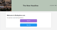
A couple of images paint a 1000 words ( or 2 ) :
Without the logo-image: Headline is nice and centred:

With the logo-image: Headline is pushed right, yuk!

So, this is my HTML (embedded in php) :
Maybe the <div id='brandInfo'> </div> is unnecessary ?
BUT, I want the phone number in that top right position.
Needs to be responsive for desktop and mobiles.
I won't post the CSS detail, because it is obviously wrong and a fresh start may be best.
I hope you can help me get this sorted.
Thanks
This is such a simple, and I assume a common design,
I am embarrassed to ask, but I can't get it working!
A couple of images paint a 1000 words ( or 2 ) :
Without the logo-image: Headline is nice and centred:
With the logo-image: Headline is pushed right, yuk!
So, this is my HTML (embedded in php) :
Maybe the <div id='brandInfo'> </div> is unnecessary ?
BUT, I want the phone number in that top right position.
Needs to be responsive for desktop and mobiles.
Code:
echo "<header>
    <div id='headerSection' style='background-color: $secondary_color;'>
        <img id='displayedLogo' src='$logoPath' alt='App Icon' class='app-icon'>
        <div id='brandInfo'>
            <span id='companyPhone' style='color: $primary_color;'>$company_phone</span>
            <h1 id='disp_brand_name' style='background-color: $secondary_color; color: $primary_color;'>$header_text</h1>
        </div>
    </div>
</header>";
I won't post the CSS detail, because it is obviously wrong and a fresh start may be best.
Code:
#headerSection {
}

#displayedLogo {
width: clamp(50px, 15vw, 100px); /* Responsive logo size */
}

#brandInfo {
}

#disp_brand_name {
 font-size: clamp(1.5rem, 5vw, 2.5rem); /* Responsive font size */
}

#companyPhone {
font-size: clamp(0.8rem, 2vw, 1rem); /* Responsive font size */
}
I hope you can help me get this sorted.
Thanks
Last edited: