vuevex
New Coder
I have a little struggle with changing background color of the drop-down menu on mobile size version. I managed to change for the desktop resolution, but the mobile version is a little stubborn 🙁
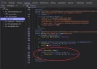
using "Inspect element" I can see it is;
@media (max-width: 768px) {
.navbar-fixed-top .navbar-collapse {
background: rgba(10, 10, 10, .9) !important;
}
with some reason I can not find this entry above in styles.css , not in bootstrap.css and nothing in woocommerce.css
all I want is to change this rgba(10, 10, 10, .9) in to rgba(255, 255, 255, 1)
I also added this in to "Additional CSS" section along with other entry's with changed colors but no luck ..
Please is there anyone here to help me to tackle this little problem ?
please view the site on victoryshopping.co.uk password; hello
Many thanks to all for any advise..
ALSO within styles.css there are Responsive Media Queries to configure, but nothing apply after changes ...
/* -------------------------------------------------------------------
Responsive Media Querries
------------------------------------------------------------------- */
@media (min-width: 600px) {
body.home .navbar-transparent {
padding-top: 15px;
padding-bottom: 15px;
background-color: #ff0000; !important;
}
.navbar-custom .sub-menu,
.navbar-custom .children {
display: block;
visibility: hidden;
position: absolute;
z-index: 10;
opacity: 0;
background-color: #ff0000;
}
.navbar-custom .open > .sub-menu,
.navbar-custom .open > .children {
visibility: visible;
opacity: 1;
background-color: #ff0000;
}
.navbar-custom .sub-menu .menu-item-has-children-toggle:after,
.navbar-custom .children .menu-item-has-children-toggle:after {
display: block;
position: absolute;
top: 50%;
right: 9px;
margin-top: -6px;
font: normal normal normal 14px/1 "ElegantIcons";
font-size: 9px;
-webkit-font-smoothing: antialiased;
-moz-osx-font-smoothing: grayscale;
content: "\45";
text-rendering: auto;
background-color: #ff0000;
}
.navbar-right .sub-menu,
.navbar-right .children {
right: 0;
left: auto;
background-color: #ff0000;
}
.navbar-nav > ul > li {
float: left;
list-style: none;
background-color: #ff0000;
}
.navbar-nav > ul li {
position: relative;
background-color: #ff0000;
}
.navbar-nav > ul li:hover > ul.children {
visibility: visible;
opacity: 1;
background-color: #ff0000;
}
.navbar-nav > li > a {
padding-top: 3px;
padding-bottom: 3px;
background-color: #ff0000;
}
using "Inspect element" I can see it is;
@media (max-width: 768px) {
.navbar-fixed-top .navbar-collapse {
background: rgba(10, 10, 10, .9) !important;
}
with some reason I can not find this entry above in styles.css , not in bootstrap.css and nothing in woocommerce.css
all I want is to change this rgba(10, 10, 10, .9) in to rgba(255, 255, 255, 1)
I also added this in to "Additional CSS" section along with other entry's with changed colors but no luck ..
Please is there anyone here to help me to tackle this little problem ?
please view the site on victoryshopping.co.uk password; hello
Many thanks to all for any advise..
ALSO within styles.css there are Responsive Media Queries to configure, but nothing apply after changes ...
/* -------------------------------------------------------------------
Responsive Media Querries
------------------------------------------------------------------- */
@media (min-width: 600px) {
body.home .navbar-transparent {
padding-top: 15px;
padding-bottom: 15px;
background-color: #ff0000; !important;
}
.navbar-custom .sub-menu,
.navbar-custom .children {
display: block;
visibility: hidden;
position: absolute;
z-index: 10;
opacity: 0;
background-color: #ff0000;
}
.navbar-custom .open > .sub-menu,
.navbar-custom .open > .children {
visibility: visible;
opacity: 1;
background-color: #ff0000;
}
.navbar-custom .sub-menu .menu-item-has-children-toggle:after,
.navbar-custom .children .menu-item-has-children-toggle:after {
display: block;
position: absolute;
top: 50%;
right: 9px;
margin-top: -6px;
font: normal normal normal 14px/1 "ElegantIcons";
font-size: 9px;
-webkit-font-smoothing: antialiased;
-moz-osx-font-smoothing: grayscale;
content: "\45";
text-rendering: auto;
background-color: #ff0000;
}
.navbar-right .sub-menu,
.navbar-right .children {
right: 0;
left: auto;
background-color: #ff0000;
}
.navbar-nav > ul > li {
float: left;
list-style: none;
background-color: #ff0000;
}
.navbar-nav > ul li {
position: relative;
background-color: #ff0000;
}
.navbar-nav > ul li:hover > ul.children {
visibility: visible;
opacity: 1;
background-color: #ff0000;
}
.navbar-nav > li > a {
padding-top: 3px;
padding-bottom: 3px;
background-color: #ff0000;
}