Welcome to Code Forum!

Join a community that supports you and your coding journey from day one. We strive to be a friendly, supportive community that empowers everyone to be better developers. By registering with us, you'll be able to discuss, share and private message with other members of our community.

SignUp Now!
  • Guest, before posting your code please take these rules into consideration:
    • It is required to use our BBCode feature to display your code. While within the editor click < / > or >_ and place your code within the BB Code prompt. This helps others with finding a solution by making it easier to read and easier to copy.
    • You can also use markdown to share your code. When using markdown your code will be automatically converted to BBCode. For help with markdown check out the markdown guide.
    • Don't share a wall of code. All we want is the problem area, the code related to your issue.

    GIF shows where to locate </> in the thread and or post editor toolbar.
    To learn more about how to use our BBCode feature, review our "How to post your code into threads" here.

    Thank you, Code Forum.

Button border problem

doctor

Coder
I made a copy of an invitation to be sent automatically to a group of participants. a sample code follows:
HTML:
<!DOCTYPE html>
<html>
  <head>
      <meta http-equiv="Content-Type" content="text/html; charset=UTF-8">
    <title>Untitled</title>
    <style>
        body {
        font-family: Verdana;   
        font-size: 20px;
        }
    .init {
        line-height: 18px;
        font-size: 1.1rem;
        }
    .init_table {
        border-collapse: separate;
        border: 1px solid #e5e5e5;
        border-radius: 8px;
          table-layout: fixed;
          width: 100%;
            
        }
    .col2 {
        width: 100%;
        padding: 21px;
        vertical-align: top;
        background-color: #f5f5f5;
        }
    .col2div1 {
        color: #069;
          font-size: 140%;
          word-wrap: break-word;
        margin-bottom: 16px;
        line-height: 34px;
        }
    .col2table {
        border-collapse: collapse;
        table-layout: fixed;
          width: auto;
          word-break: break-word;
        }
    .col2tablecol1 {
        color: #666666;
        padding-right: 10px;
          min-width: 48px;
          white-space: nowrap;
        padding-bottom: 8px;
        padding-left: 0;
          padding-top: 2px;
          vertical-align: top;
          word-wrap: break-word;
        }
    .col2tablecol2 {
        padding-left: 0;
          padding-top: 2px;
          vertical-align: top;
          word-wrap: break-word;
        }
    .col2div2 {
        color: #222222;
          font-size: 120%;
          margin-bottom: 2px;
          word-wrap: break-word;
        margin-top: 10px;
        }
    .col3 {
        border-left: 1px solid #e5e5e5;
          padding: 21px 21px 21px 0;
          vertical-align: top;
          overflow: hidden;
        padding: 21px;
        vertical-align: top;
        }
    .col3outdiv {
        padding-left: 21px;
        }
    .col3div1 {
        color: #222222;
          font-size: 140%;
          margin-bottom: 2px;
          word-wrap: break-word;
        }
    .col3div2 {
        margin-bottom: 14px;
        margin-top: 14px;
        }
    ul {
        list-style: none;
        }
    .button {
        font-size: 1.1rem;
        width: 220px;
        height:36px;
        margin: 15px 20px;
        border: 1px solid #069;
          border-radius: 7px;
        background-color: #ffefdf;
        color: #047;
        display:inline-block;
        text-decoration:none;
        text-align: center;
        vertical-align: middle;
        }
        
    .button > img,
    .button > span {
        vertical-align: middle;
        padding-top: 6px;
        }
    .button:hover,
    .button > img:hover,
    .button > span:hover {
          background-color: #ffd3aa;
        }
    .even {background-color: #e0e0e0;}
    .odd {background-color: #f5f5f5;}
    .data {
        background-color:#f5f5f5;
        border-collapse: separate;
        border: 1px solid #e5e5e5;
        border-radius: 8px;
        margin-left: 10px;
        }
    .col1data {
        border-left-color: coral;
        color: #666666;
        padding-right: 10px;
          min-width: 48px;
          white-space: nowrap;
        padding-bottom: 8px;
        padding-left: 3px;
          padding-top: 2px;
          vertical-align: top;
          word-wrap: break-word;
        font-size:1.1rem;
        }
    .col2data {
        padding-left: 3px;
        padding-right: 3px;
          word-wrap: break-word;
        vertical-align: center;
        font-size:1.2rem;
        }
    </style>
  </head>
  <body>
    <div class="init">
    <table class="init_table" cellpadding="0">
    <tr><td class="col2"><div class="col2div1">The title of the conference</div>
            <div>Add to calendar:<br>
                <a class="button" href="https://synthesi.mysch.gr/Calendar/ΔΙΚΑΙΟΣΥΝΗ.ics"><img src="https://synthesi.mysch.gr/Calendar/images/apple_24.png"> <span>iCalendar</span></a>
                <a class="button" href="https://calendar.google.com/" target="_blank"><img src="https://synthesi.mysch.gr/Calendar/images/google_calendar_24.png"><span> Google</span></a>
                <a class="button" href="https://calendar.yahoo.com/" target="_blank"><img src="https://synthesi.mysch.gr/Calendar/images/yahoo2.png"><span> Yahoo</span></a>
                <a class="button" href="https://outlook.live.com/calendar/0/action/compose" target="_blank"><img src="https://synthesi.mysch.gr/Calendar/images/outlook_24.png"><span> Outlook Web</span></a>
                <a class="button" href="https://synthesi.mysch.gr/Calendar/ΔΙΚΑΙΟΣΥΝΗ.ics"><img src="https://synthesi.mysch.gr/Calendar/images/outlook_24.png"><span> Outlook υπολογιστή</span></a>
                <a class="button" href="https://outlook.office.com/calendar/0/action/compose" target="_blank"><img src="https://synthesi.mysch.gr/Calendar/images/office_24.png"><span> Office 365</span></a>
                </div>
            <table class="col2table">
                <tr><td class="col2tablecol1">When</td>
                    <td class="col2tablecol2">Sunday 8th of December 2024</td></tr>
                <tr><td class="col2tablecol1">Where</td>
                    <td class="col2tablecol2">Somewhere</td></tr>
            </table>
        </td>
    </tr>
    </table>
      </div>
  </body>
</html>
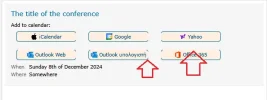
The point is that in mobile phones and tablets with small screen, the buttons do not show correctly, the border seems to be cut vertically or horizontally like in the image I post.
 

Attachments

  • cut_border.webp
    cut_border.webp
    11.4 KB · Views: 2
@doctor As far as I can see, this page isn't working responsively due to a lack of a meta tag. Adding the following to the head will "turn on" responsive in the browser.

HTML:
<meta name="viewport" content="width=device-width, initial-scale=1.0">

Doing so fixed the issue for me in Firefox. Without it, at a certain point everything begins to scale down (instead of wrap and go into a mobile responsive layout) and the browser can't render the border properly, which is the issue you are seeing.

Also, table-based layout is extremely old and was long ago kicked to the curb. I recommend re-doing this layout using modern methods such as CSS grid or flexbox if you can.
 
HTML:
<meta name="viewport" content="width=device-width, initial-scale=1.0">
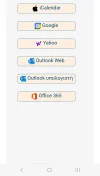
This seems to solve one of my problems. Another one. When viewing in mobile phone, text in buttons appears a little gigher than it should be like in the images.
 

Attachments

  • Screenshot_20250417_213155_Email.webp
    Screenshot_20250417_213155_Email.webp
    31.9 KB · Views: 3
  • Screenshot_20250417_213216_Gmail.webp
    Screenshot_20250417_213216_Gmail.webp
    38.9 KB · Views: 3
Last edited:
@doctor

How's this? Too much to type out an explanation...

HTML:
<!DOCTYPE html>
<html lang="en">
    <head>
            <meta http-equiv="Content-Type" content="text/html; charset=UTF-8">
        <meta name="viewport" content="width=device-width, initial-scale=1.0">
        <title>Untitled</title>
        <style>
                body {
                font-family: Verdana;   
                font-size: 20px;
                }
        .init {
                line-height: 18px;
                font-size: 1.1rem;
                }
        .init_table {
                border-collapse: separate;
                border: 1px solid #e5e5e5;
                border-radius: 8px;
                    table-layout: fixed;
                    width: 100%;
                        
                }
        .col2 {
                width: 100%;
                padding: 21px;
                vertical-align: top;
                background-color: #f5f5f5;
                }
        .col2div1 {
                color: #069;
                    font-size: 140%;
                    word-wrap: break-word;
                margin-bottom: 16px;
                line-height: 34px;
                }
        .col2table {
                border-collapse: collapse;
                table-layout: fixed;
                    width: auto;
                    word-break: break-word;
                }
        .col2tablecol1 {
                color: #666666;
                padding-right: 10px;
                    min-width: 48px;
                    white-space: nowrap;
                padding-bottom: 8px;
                padding-left: 0;
                    padding-top: 2px;
                    vertical-align: top;
                    word-wrap: break-word;
                }
        .col2tablecol2 {
                padding-left: 0;
                    padding-top: 2px;
                    vertical-align: top;
                    word-wrap: break-word;
                }
        .col2div2 {
                color: #222222;
                    font-size: 120%;
                    margin-bottom: 2px;
                    word-wrap: break-word;
                margin-top: 10px;
                }
        .col3 {
                border-left: 1px solid #e5e5e5;
                    padding: 21px 21px 21px 0;
                    vertical-align: top;
                    overflow: hidden;
                padding: 21px;
                vertical-align: top;
                }
        .col3outdiv {
                padding-left: 21px;
                }
        .col3div1 {
                color: #222222;
                    font-size: 140%;
                    margin-bottom: 2px;
                    word-wrap: break-word;
                }
        .col3div2 {
                margin-bottom: 14px;
                margin-top: 14px;
                }
        ul {
                list-style: none;
                }
        .button {
                font-size: 1.1rem;
                width: 220px;
                height:36px;
                margin: 15px 20px;
                border: 1px solid #069;
                    border-radius: 7px;
                background-color: #ffefdf;
                color: #047;
                display:inline-block;
                text-decoration:none;
                text-align: center;
                vertical-align: middle;
                }
                
        .button > img,
        .button > span {
                vertical-align: middle;
                padding-top: 6px;
                }
        .button:hover,
        .button > img:hover,
        .button > span:hover {
                    background-color: #ffd3aa;
                }
        .even {background-color: #e0e0e0;}
        .odd {background-color: #f5f5f5;}
        .data {
                background-color:#f5f5f5;
                border-collapse: separate;
                border: 1px solid #e5e5e5;
                border-radius: 8px;
                margin-left: 10px;
                }
        .col1data {
                border-left-color: coral;
                color: #666666;
                padding-right: 10px;
                    min-width: 48px;
                    white-space: nowrap;
                padding-bottom: 8px;
                padding-left: 3px;
                    padding-top: 2px;
                    vertical-align: top;
                    word-wrap: break-word;
                font-size:1.1rem;
                }
        .col2data {
                padding-left: 3px;
                padding-right: 3px;
                    word-wrap: break-word;
                vertical-align: center;
                font-size:1.2rem;
                }
        .button {
                font-size: 1.1rem;
                line-height: 1;;
                width: fit-content;
                height:36px;
                margin: 0;
                border: 1px solid #069;
                border-radius: 7px;
                background-color: #ffefdf;
                color: #047;
                display:flex;
                text-decoration:none;
                text-align: center;
                justify-content: center;
                align-items: center;
                padding: 2px 20px 6px;
        }
        .button > img {
            margin-inline-end: 7px;
        }
        .wrapper {
            display: flex;
            flex-direction: row;
            justify-content: flex-start;
            align-items: center;
            flex-wrap: wrap;
            gap: 1em;
            margin-block-end: 2rem;;
        }

        </style>
    </head>
    <body>
        <div class="init">
            <table class="init_table" cellpadding="0">
                <tr>
                    <td class="col2">
                        <div class="col2div1">
                            <h1>The Title of The Conference</h1>
                            <p>Add to calendar:</p>
                            <div class="wrapper">
                                <a class="button" href="https://synthesi.mysch.gr/Calendar/ΔΙΚΑΙΟΣΥΝΗ.ics"><img src="https://synthesi.mysch.gr/Calendar/images/apple_24.png"> <span>iCalendar</span></a>
                                <a class="button" href="https://calendar.google.com/" target="_blank"><img src="https://synthesi.mysch.gr/Calendar/images/google_calendar_24.png"><span> Google</span></a>
                                <a class="button" href="https://calendar.yahoo.com/" target="_blank"><img src="https://synthesi.mysch.gr/Calendar/images/yahoo2.png"><span> Yahoo</span></a>
                                <a class="button" href="https://outlook.live.com/calendar/0/action/compose" target="_blank"><img src="https://synthesi.mysch.gr/Calendar/images/outlook_24.png"><span> Outlook Web</span></a>
                                <a class="button" href="https://synthesi.mysch.gr/Calendar/ΔΙΚΑΙΟΣΥΝΗ.ics"><img src="https://synthesi.mysch.gr/Calendar/images/outlook_24.png"><span> Outlook υπολογιστή</span></a>
                                <a class="button" href="https://outlook.office.com/calendar/0/action/compose" target="_blank"><img src="https://synthesi.mysch.gr/Calendar/images/office_24.png"><span> Office 365</span></a>
                            </div>
                            <table class="col2table">
                                <tr><td class="col2tablecol1">When</td>
                                        <td class="col2tablecol2">Sunday 8th of December 2024</td></tr>
                                <tr><td class="col2tablecol1">Where</td>
                                    <td class="col2tablecol2">Somewhere</td></tr>
                            </table>
                        </div>
                    </td>
                </tr>
            </table>
        </div>
    </body>
</html>
 
I want all of the to have the same width.

I changed the button styles to this:

CSS:
.button {
                font-size: 1rem;
                line-height: 1;;
                width: fit-content;
                height:36px;
                margin: 0;
                border: 1px solid #069;
                border-radius: 7px;
                background-color: #ffefdf;
                color: #047;
                display:flex;
                text-decoration:none;
                text-align: center;
                justify-content: center;
                align-items: center;
                padding: 2px 20px 6px;
                flex: 0 200px;
        }
 
@doctor

So this is for an email? That's a whole different story.

Email coding is an ancient Voodoo art form. Born of the Dark Arts and handed down through painful lessons throughout the Ages.

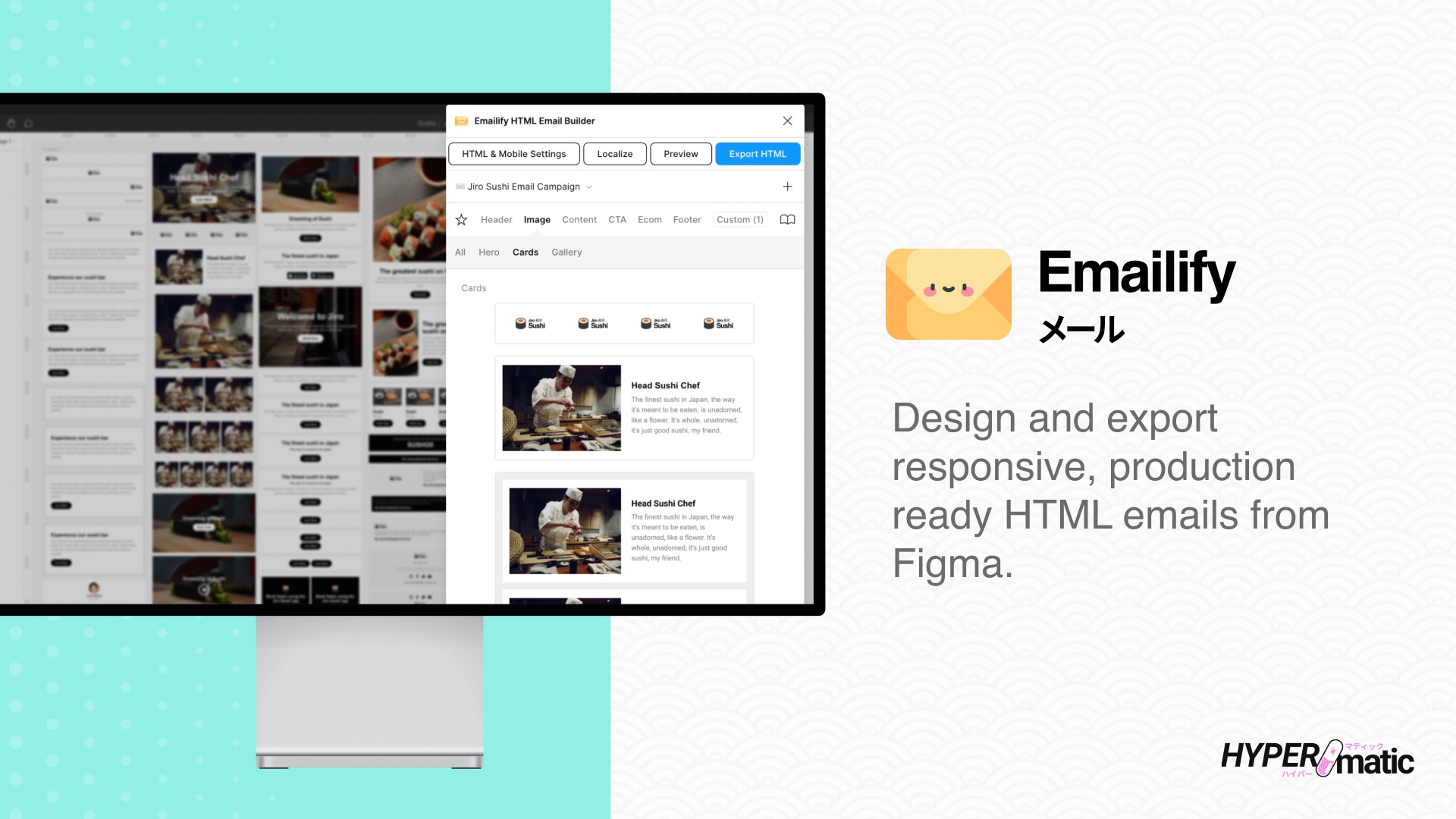
We use a tool for email creation. Emailify plugin inside Figma.

The basic idea is a desktop email is, let's say, 600px wide. Anything below 600 is mobile. This is done using media queries.

In the case of your buttons, each would be in a column and would stack immediately below 600px.

I can try to put this together for you as a sample but would take some time.

You could continue with display: inline-block; but adjust padding and margins on the left and right of the buttons so that they fit inside your smallest viewport width. We try to shoot for no wider than 300px on the buttons which allows a small buffer left and right.

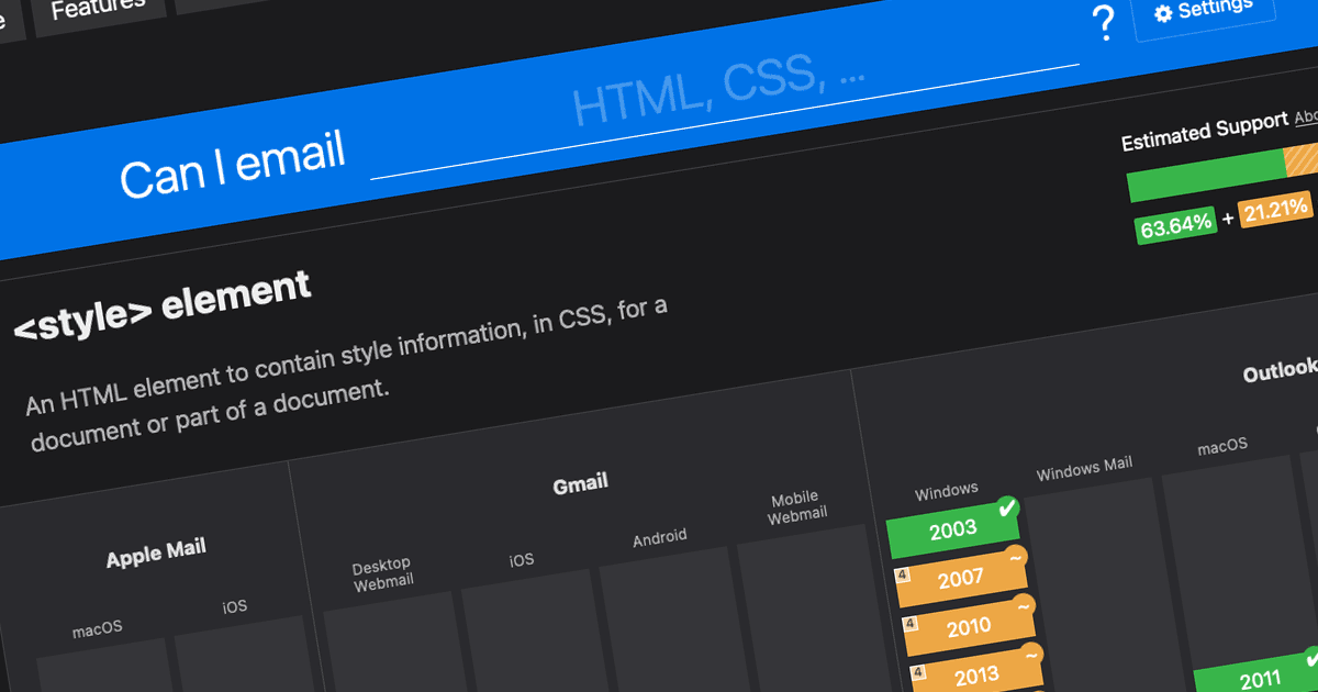
A helpful tool:

 
Last edited:
The point is to have a good looking response to be sent automatically to everyone who fills in a form. The buttons are meant to be able to add the event in user's calendar. I do not know what to do. If I have to use a free plugin, I will use it.
 
The point is to have a good looking response to be sent automatically to everyone who fills in a form. The buttons are meant to be able to add the event in user's calendar. I do not know what to do. If I have to use a free plugin, I will use it.

I can try to do this section in our tool and see if it's something you can use. Another very easy way to pull this off would be to use images for the buttons and wrap them in <a> tags.
 
@doctor I know this is a lot, but our tool does a great job with email client compatibility. I also added a sample using images. Adjust as needed.


Note: The tool we use adds Microsoft-specific code for compatibility, which is what all the mso stuff is.

If you use Figma, the tool we use is called Emailify:
 
Back
Top Bottom