Welcome!

By registering with us, you'll be able to discuss, share and private message with other members of our community.

SignUp Now!
  • Guest, before posting your code please take these rules into consideration:
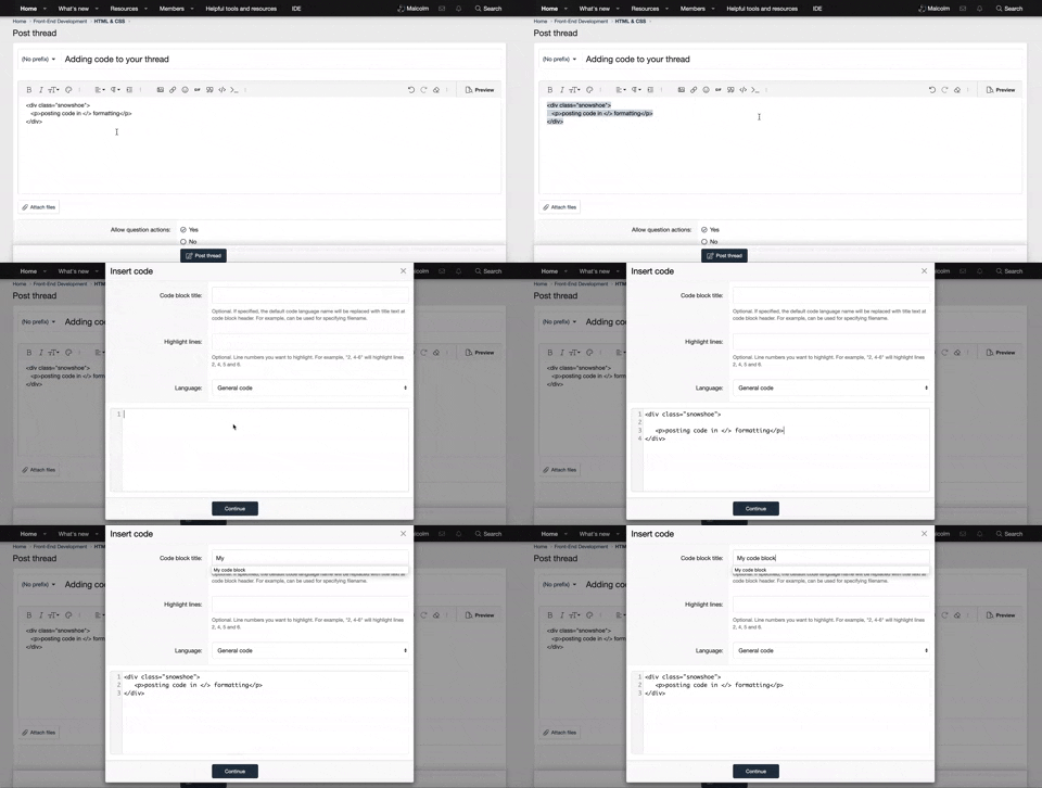
    • It is required to use our BBCode feature to display your code. While within the editor click < / > or >_ and place your code within the BB Code prompt. This helps others with finding a solution by making it easier to read and easier to copy.
    • You can also use markdown to share your code. When using markdown your code will be automatically converted to BBCode. For help with markdown check out the markdown guide.
    • Don't share a wall of code. All we want is the problem area, the code related to your issue.


    To learn more about how to use our BBCode feature, please click here.

    Thank you, Code Forum.

HTML & CSS I need help with a dropdown navbar

I am currently working as an intern for a company that owns a restaurant/hotel, and they have given me access to their website which they want me to improve. So far I have been able to get a pretty good understanding of the code that the former developer left behind (even though its quite a messy one). But I have been struggling to get the navbar working correctly.
This is the test-site I made for the edited version of the page: http://handig.dk/test/index.html (my apologies for it not being in english)

If you try to click on "menukort", you will notice that a dropdown menu appears. The first problem here is that the dropdown does not appear when I hover over the list item. Secondly, try to go to another section of the page, and then click on "menukort". When you do this, the page jumps back to the first section. I do not want it to do this. I want it to STAY at the section I am currently in. Again, this could be avoided if I could make the dropdown appear on hover.

The last problem is in mobile view. The menu remains open after it has taken me to the section of the page I want to go to. I need to manually close it if I want it to go away. I think this is purely a JavaScript thing. I would like it to close itself after reaching the section I want to go to.

I made a codepen for the navbar, so that it is a bit easier to have an overview of it. https://codepen.io/marc-liljeqvist/pen/vYGvQrp
 
Last edited:
UPDATE: I managed to get the dropdown to appear by changing
nav ul li a:hover .nav-dropdown to nav ul li:hover .nav-dropdown, but now I am facing a new problem which I think has to do with the one-page layout structure. Once I have clicked on one of the links in the dropdown menu, I can not get it to appear again unless I refresh the site.
The JavaScript problem is also still there.
I tried adding this to the script
JavaScript:
    $('.nav-dropdown li a').on("click", function(){
    $('#nav-toggle').slideUp();
   });
but it did nothing sadly.
 
Last edited by a moderator:
Hi there,

Welcome to Code Forum!

To help us better answer this thread can you include the HTML, CSS and JavaScript for the drop-down? I'm assuming that its a JavaScript-related issue.
 
Hi. I included it all here. https://codepen.io/marc-liljeqvist/pen/vYGvQrp
I thought maybe it would be easier to read.

But I will post it here too then =)

[CODE lang="html" title="HTML"] <section class="navigation">
<div class="nav-container" id="myHeader">
<nav>
<div class="nav-mobile"><a id="nav-toggle" href="#!"><span></span></a></div>
<ul class="nav-list">
<li><a href="#">Forside</a></li>
<li><a href="#om_os">Om os</a></li>
<li> <a href="#">Menukort</a>
<ul class="nav-dropdown">
<li><a href="#frokost">Frokost</a></li>
<li><a href="#aften">Aften</a></li>
<li><a href="#drikke">Drikkevarer</a></li>
</ul>
</li>
<li><a href="https://book.dinnerbooking.com/dk/da-DK/book/table/pax/1620/3">Bordbestilling</a></li>
<li> <a href="#ud_af_huset">Mad ud af huset</a>
<ul class="nav-dropdown">
<li><a href="#take_away">Take Away</a></li>
<li><a href="#festbuffet">Festbuffet</a></li>
<li><a href="#brunch">Brunch</a></li>
<li><a href="#reception">Receptionsmad</a></li>
</ul>
</li>
<li><a href="#selskaber">Selskaber</a></li>
<li><a href="#hotellet">Hotellet</a></li>
<li><a href="#find">Find os</a></li>
</ul>
</nav>
</div>
</section>[/CODE]

[CODE lang="css" title="CSS"].nav-container {
display: flex;
justify-content: center;
max-width: 100%;
margin: 0 auto;
background-color: #f1f1f1;
}
.navigation {
display: flex;
justify-content: center;
height: 70px;
background-color: #f1f1f1;
}

nav ul {
list-style: none;
margin: 0;
padding: 0;
background-color: #f1f1f1;
}
nav ul li {
float: left;
position: relative;
background-color: #f1f1f1;
}
nav ul li a,
nav ul li a:visited {
display: block;
padding: 0 20px;
line-height: 70px;
color: #333;
text-decoration: none;
background-color: #f1f1f1;
}
nav ul li a:hover,
nav ul li a:visited:hover {
color: #84a0a8;
}
nav ul li a:not:)only-child):after,
nav ul li a:visited:not:)only-child):after {
padding-left: 4px;
content: '';
}
nav ul li ul li {
min-width: 190px;
}
nav ul li ul li a {
padding: 15px;
line-height: 20px;
}
.nav-dropdown {
position: absolute;
display: none;
z-index: 1;
box-shadow: 0 3px 12px rgba(0, 0, 0, 0.15);
background-color: #f1f1f1;
}
nav ul li:hover .nav-dropdown {
display: block;
}
.sticky {
position: fixed;
top: 0;
width: 100%;
box-shadow: 0 2px 4px 0 rgba(0,0,0,.2);
}

.sticky + .nav-container {
padding-top: 102px;
}

/* Mobile navigation */
.nav-mobile {
display: none;
height: 35px;/* ???? */
/*width: 25px;*/
}

@media only screen and (max-width: 798px) {
.nav-mobile {
display: block;
position:relative;
}
nav {
width: 100%;
padding: 70px 0 15px;
}
nav ul {
display: none;
}
nav ul li {
float: none;
}
nav ul li a {
padding: 15px;
line-height: 20px;
}
nav ul li ul li a {
padding-left: 30px;
}

.nav-dropdown {
position: static;
}
}
@media screen and (min-width: 799px) {
.nav-list {
display: block !important;
}
}
#nav-toggle{
position:relative;
padding:10px 35px 16px;
display:table;
margin:-35px auto 0;
}
#nav-toggle span{margin:auto;left:0;right:0;}
#nav-toggle span,
#nav-toggle span:before,
#nav-toggle span:after {
cursor: pointer;
border-radius: 1px;
height: 5px;
width: 35px;
background: #333;
position: absolute;
display: block;
content: "";
transition: all 300ms ease-in-out;
}
#nav-toggle span:before {
top: -10px;
}
#nav-toggle span:after {
bottom: -10px;
}
#nav-toggle.active span {
background-color: transparent;
}
#nav-toggle.active span:before,
#nav-toggle.active span:after {
top: 0;
}
#nav-toggle.active span:before {
transform: rotate(45deg);
}
#nav-toggle.active span:after {
transform: rotate(-45deg);
}[/CODE]

[CODE lang="javascript" title="JS"](function($) { // Begin jQuery
$(function() { // DOM ready
// If a link has a dropdown, add sub menu toggle.
$('nav ul li a:not:)only-child)').click(function(e) {
$(this).siblings('.nav-dropdown').toggle();
// Close one dropdown when selecting another
$('.nav-dropdown').not($(this).siblings()).hide();
e.stopPropagation();
});
// Clicking away from dropdown will remove the dropdown class
$('html').click(function() {
$('.nav-dropdown').hide();
});
// Toggle open and close nav styles on click
$('#nav-toggle').click(function() {
$('nav ul').slideToggle();
});
// Hamburger to X toggle
$('#nav-toggle').on('click', function() {
this.classList.toggle('active');
});
$('.nav-dropdown li a').on("click", function(){
$('#nav-toggle').slideUp();
});
}); // end DOM ready
})(jQuery); // end jQuery[/CODE]
Hi there,

Welcome to Code Forum!

To help us better answer this thread can you include the HTML, CSS and JavaScript for the drop-down? I'm assuming that its a JavaScript-related issue.
 

New Threads

Buy us a coffee!

Back
Top Bottom