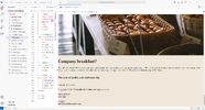
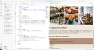
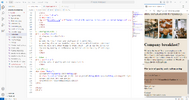
Hey! Im a beginner, and I don´t understand why the footer background disappear when I watch the website from my computer? The three images in a row is in a row in small screen, but on the computer they get separated. will be grateful for any help.
Here is my coding:
Here is my coding:
HTML:
<!DOCTYPE html>
<html lang="en">
<head>
<meta charset="utf-8">
<meta name="viewport" content="width=device-width, initial-scale=1">
<!--Länk till css-->
<link rel="stylesheet" href="stylesheet.css">
<!--Titel-->
<title>Crumble & Cookies</title>
</head>
<body>
<!--Teckensnitt-->
<link rel="preconnect" href="https://fonts.googleapis.com">
<link rel="preconnect" href="https://fonts.gstatic.com" crossorigin>
<link href="https://fonts.googleapis.com/css2?family=Klee+One:wght@600&display=swap" rel="stylesheet">
<link rel="preconnect" href="https://fonts.googleapis.com">
<link rel="preconnect" href="https://fonts.gstatic.com" crossorigin>
<link href="https://fonts.googleapis.com/css2?family=Playfair+Display&display=swap" rel="stylesheet">
<!--Logotyp-->
<link rel="icon" type="image/jpg" href="Munkar.jpg">
<!--Navigation bar-->
<header>
<div class="logo">Crumble & Cookies</div>
<div class="hamburger">
<div class="line"></div>
<div class="line"></div>
<div class="line"></div>
</div>
<nav class="nav-bar">
<ul>
<li><a href="#" class="active">Home</a></li>
<li><a href="#">Our story</a></li>
<li><a href="#">Menu</a></li>
<li><a href="#">Order</a></li>
<li><a href="#">Visit us</a></li>
</ul>
</nav>
</header>
<script>
hamburger = document.querySelector(".hamburger");
hamburger.onclick = function(){
navBar = document.querySelector(".nav-bar");
navBar.classList.toggle("active")
}
</script>
<!--Slideshow-->
<div class="header">
<div class="image-slideshow">
<div class="image fade">
<img src="Crossiants.jpg" alt="Nine crossiants on a plate" class="responsive" style="max-width: 100%;">
</div>
<div class="image fade">
<img src="knadar-deg.jpg" alt="Hand kneading a dough" class="responsive" style="max-width: 100%;">
</div>
<div class="image fade">
<img src="Munkar.jpg" alt="Lots of donuts on plates with bread in the background" class="responsive" style="max-width: 100%;">
</div>
</div>
</div>
<script src="main.js"></script>
<!--Text över slider-->
<div class="slideshow">
<h1>At Crumble and Cookies, we're more than just a bakery. We're a heartfelt celebration of wholesome goodness, handcrafted with love and passion.</h1>
</div>
<!--Huvudinnehåll-->
<main>
<h2>Nestled in the heart of Edinburgh, our small, organic bakery is a place where every bite tells a story of flavor, tradition, and dedication to quality.</h2>
</main>
<!--Bildspalt-->
<div class="row">
<div class="column">
<a href="menu">
<img src="Monter-med-bakverk.jpg" alt="confectionery counter with pastries" style="width: 100%">
</a>
</div>
<div class="column">
<a href="menu">
<img src="Bakverk.jpg" alt="a puff pastry in the spotlight, surrounded by several others" style="width: 100%">
</a>
</div>
<div class="column">
<a href="menu">
<img src="Produkter.jpg" alt="baskets filled with pastries in focus with a blurred background" style="width: 100%">
</a>
</div>
</div>
<!--Företagsfrukost?-->
<div class="breakfast">
<h1>Company breakfast?</h1>
<p>We make the bread! Treat your employees with sandwiches, or anything else on our breakfast menu. We at Crumble & Cookies understand that you have many other things to think about - let us fix the coffee for the morning meeting or conference. We deliver within the city of Edinburgh.</p>
</div>
<!--Citat-->
<div class="citat">
<h3>The taste of quality and craftsmanship</h3>
</div>
<!--Sidfot-->
<div class="footer">
<p>Crumble & Cookies </p>
<p class="copyright">Copyright © 2015 <strong>Crumble & Cookies </strong>All rights reserved</p>
<p>Open all days <br> 6am-5pm</p>
<p>Contact<br> [email protected]</p>
</div>
</body>
</html>
CSS:
/* Bakgrundsfärg */
body {
    box-sizing: border-box;
    margin: 0;
    padding: 0;
    background-color: #efe7da;
    display: flex;
    flex-direction: column;
}

/*Menyflikar*/
header {
    max-width: 100%;
    height: auto;
    background: #b29079;
    display: flex;
    align-items: center;
    justify-content: space-between;
    padding: 0 100px;
}

.logo {
    margin: 0 5px;
    padding: 10px 25px;
    border-radius: 50px;
    font-size: 4vh;
    font-family: "klee one";
    font-weight: bold;
    color: white;
}

.hamburger {
    display: none;
}

.nav-bar ul {
    display: flex;
    list-style: none;
}

.nav-bar ul li a {
    display: block;
    color: white;
    font-family: "playfair display";
    font-size: 3vh;
    padding: 10px 25px;
    border-radius: 50px;
    transition: 0.2s;
    margin: 0 5px;
    text-decoration: none;
}

.nav-bar ul li a:hover {
    color: white;
    background: pink;
}

.nav-bar ul li a.active {
    color: white;
    background: pink;
}

@media (max-width: 1320px) {
    header {
        padding: 0 50px;
    }
}

@media (max-width: 900px) {
    .nav-bar {
        height: 0px;
        display: none;
    }

    .hamburger {
        display: block;
        cursor: pointer;
    }

    .line {
        width: 28px;
        height: 2px;
        background-color: white;
        margin: 4px 0;
        border-radius: 2px;
    }

    .nav-bar {
        overflow: hidden;
        transition: 0.2s;
    }

    .nav-bar.active {
        display: block;
        height: 150px;
    }
}

/*Text över slider*/
.slideshow h1 {
    font-family: "klee one";
    font-size: 4vh;
    font-weight: bold;
    text-align: center;
    margin-top: 50px;
}

/*Huvudinnehåll*/
main h2 {
    font-family: "playfair display";
    font-size: 4vh;
    text-align: center;
    margin-top: 50px;
}

/*Bildspalt*/
.row {
    display: flex;
    justify-content: space-around;
    margin: 50px 0;
}

.column {
    flex: 1;
    max-width: 30%;
}

.column img {
    max-width: 100%;
}

/*Företagsfrukost?*/
.breakfast {
    background-color: #b29079;
    padding: 50px 0;
    text-align: center;
}

.breakfast h1 {
    font-family: "klee one";
    font-size: 4vh;
    font-weight: bold;
    margin: 10px;
}

.breakfast p {
    font-family: "playfair display";
    font-size: 3vh;
}

/*Citat*/
.citat {
    background-color: #d3b1a0;
    padding: 50px 0;
    text-align: center;
}

.citat h3 {
    font-family: "playfair display";
    font-size: 3vh;
}

/*Sidfot*/
.footer {
    background-color: #b29079;
    padding: 20px 0;
    text-align: center;
}

.footer p {
    font-family: "playfair display";
    font-size: 3vh;
    margin: 10px;
}

.copyright {
    color: white;
}
Last edited by a moderator: