Welcome to Code Forum!

Join a community that supports you and your coding journey from day one. We strive to be a friendly, supportive community that empowers everyone to be better developers. By registering with us, you'll be able to discuss, share and private message with other members of our community.

SignUp Now!
  • Guest, before posting your code please take these rules into consideration:
    • It is required to use our BBCode feature to display your code. While within the editor click < / > or >_ and place your code within the BB Code prompt. This helps others with finding a solution by making it easier to read and easier to copy.
    • You can also use markdown to share your code. When using markdown your code will be automatically converted to BBCode. For help with markdown check out the markdown guide.
    • Don't share a wall of code. All we want is the problem area, the code related to your issue.

    GIF shows where to locate </> in the thread and or post editor toolbar.
    To learn more about how to use our BBCode feature, review our "How to post your code into threads" here.

    Thank you, Code Forum.

Why does the background on the footer and images columns disappear on bigger screens ?

Hey! Im a beginner, and I don´t understand why the footer background disappear when I watch the website from my computer? The three images in a row is in a row in small screen, but on the computer they get separated. will be grateful for any help.
Here is my coding:


HTML:
<!DOCTYPE html>
<html lang="en">

<head>
    <meta charset="utf-8">
    <meta name="viewport" content="width=device-width, initial-scale=1">
    <!--Länk till css-->
    <link rel="stylesheet" href="stylesheet.css">
    <!--Titel-->
    <title>Crumble&nbsp;&&nbsp;Cookies</title>
</head>

<body>
    <!--Teckensnitt-->
    <link rel="preconnect" href="https://fonts.googleapis.com">
    <link rel="preconnect" href="https://fonts.gstatic.com" crossorigin>
    <link href="https://fonts.googleapis.com/css2?family=Klee+One:wght@600&display=swap" rel="stylesheet">
    <link rel="preconnect" href="https://fonts.googleapis.com">
    <link rel="preconnect" href="https://fonts.gstatic.com" crossorigin>
    <link href="https://fonts.googleapis.com/css2?family=Playfair+Display&display=swap" rel="stylesheet">
    <!--Logotyp-->
    <link rel="icon" type="image/jpg" href="Munkar.jpg">
    <!--Navigation bar-->
    <header>
        <div class="logo">Crumble&nbsp;&&nbsp;Cookies</div>
        <div class="hamburger">
            <div class="line"></div>
            <div class="line"></div>
            <div class="line"></div>
        </div>
        <nav class="nav-bar">
            <ul>
                <li><a href="#" class="active">Home</a></li>
                <li><a href="#">Our&nbsp;story</a></li>
                <li><a href="#">Menu</a></li>
                <li><a href="#">Order</a></li>
                <li><a href="#">Visit&nbsp;us</a></li>
            </ul>
        </nav>
    </header>
    <script>
        hamburger = document.querySelector(".hamburger");
        hamburger.onclick = function(){
            navBar = document.querySelector(".nav-bar");
            navBar.classList.toggle("active")
        }
    </script>
    <!--Slideshow-->
    <div class="header">
        <div class="image-slideshow">
            <div class="image fade">
                <img src="Crossiants.jpg" alt="Nine crossiants on a plate" class="responsive" style="max-width: 100%;">
            </div>
            <div class="image fade">
                <img src="knadar-deg.jpg" alt="Hand kneading a dough" class="responsive" style="max-width: 100%;">
            </div>
            <div class="image fade">
                <img src="Munkar.jpg" alt="Lots of donuts on plates with bread in the background" class="responsive" style="max-width: 100%;">
            </div>
        </div>
    </div>
    <script src="main.js"></script>

    <!--Text över slider-->
    <div class="slideshow">
        <h1>At Crumble and Cookies, we're more than just a bakery. We're a heartfelt celebration of wholesome goodness, handcrafted with love and passion.</h1>
    </div>
    <!--Huvudinnehåll-->
    <main>
        <h2>Nestled in the heart of Edinburgh, our small, organic bakery is a place where every bite tells a story of flavor, tradition, and dedication to quality.</h2>
    </main>
    <!--Bildspalt-->
    <div class="row">
        <div class="column">
            <a href="menu">
                <img src="Monter-med-bakverk.jpg" alt="confectionery counter with pastries" style="width: 100%">
            </a>
        </div>
        <div class="column">
            <a href="menu">
                <img src="Bakverk.jpg" alt="a puff pastry in the spotlight, surrounded by several others" style="width: 100%">
            </a>
        </div>
        <div class="column">
            <a href="menu">
                <img src="Produkter.jpg" alt="baskets filled with pastries in focus with a blurred background" style="width: 100%">
            </a>
        </div>
    </div>
    <!--Företagsfrukost?-->
    <div class="breakfast">
        <h1>Company breakfast?</h1>
        <p>We make the bread! Treat your employees with sandwiches, or anything else on our breakfast menu. We at Crumble & Cookies understand that you have many other things to think about - let us fix the coffee for the morning meeting or conference. We deliver within the city of Edinburgh.</p>
    </div>
    <!--Citat-->
    <div class="citat">
        <h3>The taste of quality and craftsmanship</h3>
    </div>
    <!--Sidfot-->
    <div class="footer">
        <p>Crumble&nbsp;&&nbsp;Cookies&nbsp;</p>
        <p class="copyright">Copyright © 2015 <strong>Crumble&nbsp;&&nbsp;Cookies&nbsp;</strong>All rights reserved</p>
        <p>Open all days <br> 6am-5pm</p>
        <p>Contact<br> [email protected]</p>
    </div>
</body>

</html>

CSS:
/* Bakgrundsfärg */
body {
    box-sizing: border-box;
    margin: 0;
    padding: 0;
    background-color: #efe7da;
    display: flex;
    flex-direction: column;
}

/*Menyflikar*/
header {
    max-width: 100%;
    height: auto;
    background: #b29079;
    display: flex;
    align-items: center;
    justify-content: space-between;
    padding: 0 100px;
}

.logo {
    margin: 0 5px;
    padding: 10px 25px;
    border-radius: 50px;
    font-size: 4vh;
    font-family: "klee one";
    font-weight: bold;
    color: white;
}

.hamburger {
    display: none;
}

.nav-bar ul {
    display: flex;
    list-style: none;
}

.nav-bar ul li a {
    display: block;
    color: white;
    font-family: "playfair display";
    font-size: 3vh;
    padding: 10px 25px;
    border-radius: 50px;
    transition: 0.2s;
    margin: 0 5px;
    text-decoration: none;
}

.nav-bar ul li a:hover {
    color: white;
    background: pink;
}

.nav-bar ul li a.active {
    color: white;
    background: pink;
}

@media (max-width: 1320px) {
    header {
        padding: 0 50px;
    }
}

@media (max-width: 900px) {
    .nav-bar {
        height: 0px;
        display: none;
    }

    .hamburger {
        display: block;
        cursor: pointer;
    }

    .line {
        width: 28px;
        height: 2px;
        background-color: white;
        margin: 4px 0;
        border-radius: 2px;
    }

    .nav-bar {
        overflow: hidden;
        transition: 0.2s;
    }

    .nav-bar.active {
        display: block;
        height: 150px;
    }
}

/*Text över slider*/
.slideshow h1 {
    font-family: "klee one";
    font-size: 4vh;
    font-weight: bold;
    text-align: center;
    margin-top: 50px;
}

/*Huvudinnehåll*/
main h2 {
    font-family: "playfair display";
    font-size: 4vh;
    text-align: center;
    margin-top: 50px;
}

/*Bildspalt*/
.row {
    display: flex;
    justify-content: space-around;
    margin: 50px 0;
}

.column {
    flex: 1;
    max-width: 30%;
}

.column img {
    max-width: 100%;
}

/*Företagsfrukost?*/
.breakfast {
    background-color: #b29079;
    padding: 50px 0;
    text-align: center;
}

.breakfast h1 {
    font-family: "klee one";
    font-size: 4vh;
    font-weight: bold;
    margin: 10px;
}

.breakfast p {
    font-family: "playfair display";
    font-size: 3vh;
}

/*Citat*/
.citat {
    background-color: #d3b1a0;
    padding: 50px 0;
    text-align: center;
}

.citat h3 {
    font-family: "playfair display";
    font-size: 3vh;
}

/*Sidfot*/
.footer {
    background-color: #b29079;
    padding: 20px 0;
    text-align: center;
}

.footer p {
    font-family: "playfair display";
    font-size: 3vh;
    margin: 10px;
}

.copyright {
    color: white;
}
 
Last edited by a moderator:
Hey elleng01,

Lets take alook at the issues you are getting here one by one 🙂

Footer Background Disappearing:The issue seems to be with the footer background. From your code, the background color for the footer is set to #b29079, which seems fine. However, it might be possible that the footer is collapsing because there's no content inside or some other styling issue from elsewhere in the CSS that's not provided.

To diagnose, please check if there are any other styles that affect the .footer in other parts of the CSS. As a quick solution, try setting a fixed height for the footer to see if the background appears:

CSS:
.footer {
    background: #b29079;
    font-size: 1em;
    height: 100px;  /* adding a fixed height */
}

Three Images in a Row:The images are within a flex container .row and each image is within a .column. On larger screens, these should be side by side, taking up 1/3 of the width each. However, they might get separated due to any number of reasons including margin, padding, or the intrinsic width of the images.

For a quick fix, ensure that the total width doesn't exceed 100%. This can be done by setting the box-sizing to border-box:

CSS:
.row, .column {
    box-sizing: border-box;
}

Also, make sure your images don't have a margin that could push them apart. You can reset any margins on the images within the columns:

CSS:
.column img {
    margin: 0;
}

Media Queries:There's a missing closing brace in your media queries. The media query for (max-width: 1320px) needs to be closed before the next media query starts:

CSS:
@media (max-width: 1320px){
    header{
            padding: 0 50px;
        }
} /* Add closing brace here */

Lastly, always make sure your CSS and HTML have matching tags and braces. Missed or mismatched tags/braces can lead to unexpected behaviors.

Try these solutions, and if the issues persist, please provide the additional CSS (if any) and specify which browsers and screen sizes you are testing on, so we can help further.
 
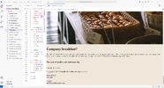
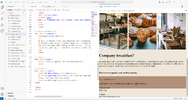
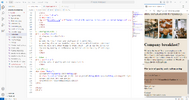
Hey! Thank you so much for the help, unfortely it still does not work...I changed everything you wrote but there was no difference 🙁 I have attached pictures of my workspace and how it looks when i preview. I don´t have additional CSS, but I send the codes again now when I have changed the things you said. Im very grateful for your help.

HTML
<!DOCTYPE html>
<html lang="en">
<head>
<meta charset="utf-8">
<meta name="viewport" content="width=device-width, initial-scale=1">
<!--Länk till css-->
<link rel="stylesheet" href="stylesheet.css">
<!--Titel-->
<title>Crumble&nbsp;&&nbsp;Cookies</title>
</head>
<body>
<!--Teckensnitt-->
<link rel="preconnect" href="https://fonts.googleapis.com">
<link rel="preconnect" href="https://fonts.gstatic.com" crossorigin>
<link href="https://fonts.googleapis.com/css2?family=Klee+One:wght@600&display=swap" rel="stylesheet">
<link rel="preconnect" href="https://fonts.googleapis.com">
<link rel="preconnect" href="https://fonts.gstatic.com" crossorigin>
<link href="https://fonts.googleapis.com/css2?family=Playfair+Display&display=swap" rel="stylesheet">
<!--Logotyp-->
<link rel="icon" type="image/jpg" href="Munkar.jpg">
<!--Navigation bar-->
<header>
<div class="logo">Crumble&nbsp;&&nbsp;Cookies</div>
<div class="hamburger">
<div class="line"></div>
</div>
<nav class="nav-bar">
<ul>
<li>
<a href="#" class="active">Home</a>
</li>
<li>
<a href="#">Our&nbsp;story</a>
</li>
<li>
<a href="#">Menu</a>
</li>
<li>
<a href="#">Order</a>
</li>
<li>
<a href="#">Visit&nbsp;us</a>
</li>
</ul>
</nav>
</header>
<script>
hamburger = document.querySelector(".hamburger");
hamburger.onclick = function(){
navBar = document.querySelector(".nav-bar");
navBar.classList.toggle("active")
}
</script>
<!--Slideshow-->
<div class="header">
<div class="image-slideshow">
<div class="image fade">
<img src="Crossiants.jpg" alt="Nine crossiants on a plate" class="responsive" style="max-width: 100%;">
</div>
<div class="image fade">
<img src="knadar-deg.jpg" alt="Hand kneading a dough" class="responsive" style="max-width: 100%;">
</div>
<div class="image fade">
<img src="Munkar.jpg" alt="Lots of donuts on plates with bread in the background" class="responsive" style="max-width: 100%;">
</div>
</div>
</div>
<script src="main.js"></script>

<!--Text över slider-->
<div class="slideshow">
<h1>At Crumble and Cookies, we're more than just a bakery. We're a heartfelt celebration of wholesome goodness,
handcrafted with love and passion.</h1>
</div>
<!--Huvudinnehåll-->
<main>
<h2>Nestled in the heart of Edinburgh, our small, organic bakery is a place where
every bite tells a story of flavor, tradition, and dedication to quality.</h2>
</main>
<!--Bildspalt-->
<div class="row">
<div class="column">
<a href="menu">
<img src="Monter-med-bakverk.jpg" alt="confectionery counter with pastries" style="width: 100%">
</a>
</div>
<div class="column">
<a href="menu">
<img src="Bakverk.jpg" alt="a puff pastry in the spotlight, surrounded by several others" style="width: 100%">
</a>
</div>
<div class="column">
<a href="menu">
<img src="Produkter.jpg" alt="baskets filled with pastries in focus with a blurred background" style="width: 100%">
</a>
</div>
</div>
<!--Företagsfrukost?-->
<div class="breakfast">
<h1>Company breakfast?</h1>
<p>
We make the bread! Treat your employees with sandwiches,
or anything else on our breakfast menu. We at Crumble & Cookies understand
that you have many other things to think about - let us fix the coffee for
the morning meeting or conference. We deliver within the city of Edinburgh.
</p>
</div>
<!--Citat-->
<div class="citat">
<h3>The taste of quality and craftsmanship</h3>
</div>
<!--Sidfot-->
<div class="footer">
<p>Crumble&nbsp;&&nbsp;Cookies&nbsp;</p>
<p class="copyright">Copyright © 2015 <strong>Crumble&nbsp;&&nbsp;Cookies&nbsp;</strong>All rights reserved</p>
<p>Open all days <br> 6am-5pm</p>
<p>Contact<br> [email protected]</p>
</div>
</body>
</html>

CSS
/* Bakgrundsfärg */
body {
box-sizing: border-box;
margin: 0;
padding: 0;
background-color: #efe7da;
display: flex;
flex-direction: column;
}
/Menyflikar/
header{
max-width: 100%;
height: auto;
background: #b29079;
display: flex;
align-items: center;
justify-content: space-between;
padding: 0 100px;
}
.logo{
margin: 0 5px;
padding: 10px 25px;
border-radius: 50px;
font-size: 4vh;
font-family: "klee one";
font-weight: bold;
color: white;
}
.hamburger{
display: none;
}
.nav-bar ul{
display: flex;
list-style: none;
}
.nav-bar ul li a{
display: block;
color: white;
font-family: "playfair display";
font-size: 3vh;
padding: 10px 25px;
border-radius: 50px;
transition: 0.2s;
margin: 0 5px;
text-decoration: none;
}
.nav-bar ul li a:hover{
color: white;
background: pink;
}
.nav-bar ul li a.active{
color: white;
background: pink;
}
@media (max-width: 1320px){
header{
padding:0 50px;
}
}
@media (max-width: 900px){
.nav-bar{
height: 0px;
display: none;
}
.hamburger{
display: block;
cursor: pointer;
}

.hamburger .line{
width: 30px;
height: 3px;
background: pink;
margin: 6px 0;
}
.nav-bar{
height: 0px;
position: absolute;
top: 80px;
left: 0;
right: 0;
width: 100%;
background: pink;
transition: 0.5s;
overflow: hidden;
}
.nav-bar.active{
height: 400px;
}
.nav-bar ul{
display: block;
width: fit-content;
margin: 80px auto 0 auto;
text-align: center;
transition: 0.5s;
}
.nav-bar ul li a{
margin-bottom: 12px;
color: white;
}

/Slideshow/
.header {
padding: 20px;
}
.responsive {
width: 100%;
height: auto;
}
*{
box-sizing: border-box;
}
.image-slideshow{
max-width: 100%;
position: relative;
margin: auto;
}
img{
width: 100%;
}
.fade{
animation-name: fade;
animation-duration: 10s;
}
@keyframes fade{
from {opacity: .5;}
to {opacity: .1;}
}
.slideshow{
font-family: "klee one";
font-style: italic;
}
/Main/
h2{
font-family: "playfair display";
font-size: 4vh;
font-weight: lighter;
}
/Bildspalt/
.column img {
margin: 0;
}
.row {
box-sizing: border-box;
display: flex;
}
.column {
box-sizing: border-box;
flex: 33.33%;
padding: 5px;
}

/Sidfot/
.footer {
background: #b29079;
font-size: 1em;
height: 100px;
}


JS
/* Slideshow */
let index = 0;
displayImages ();
function displayImages (){
let i;
const images = document.getElementsByClassName ("image");
for (i = 0; i < images.length; i++){
images.style.display = "none";
}
index++;
if (index > images.length){
index = 1;
}
images [index-1].style.display = "block";
setTimeout(displayImages, 2000);
}
big screen.pngmiddle screen.pngsmall screen.png
 
Back
Top Bottom