Welcome!

By registering with us, you'll be able to discuss, share and private message with other members of our community.

SignUp Now!
  • Guest, before posting your code please take these rules into consideration:
    • It is required to use our BBCode feature to display your code. While within the editor click < / > or >_ and place your code within the BB Code prompt. This helps others with finding a solution by making it easier to read and easier to copy.
    • You can also use markdown to share your code. When using markdown your code will be automatically converted to BBCode. For help with markdown check out the markdown guide.
    • Don't share a wall of code. All we want is the problem area, the code related to your issue.


    To learn more about how to use our BBCode feature, please click here.

    Thank you, Code Forum.

HTML & CSS Problem aligning text next to image. CSS

mrsthing

New Coder
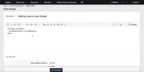
This is the link to my code 2 I had to put an orange as an image because the actual image was in my file.

This is what I am trying to do: Align the text to the right like this 1.

Also, how would I control the spacing in between ‘How it works’ and ‘Testimonials’, I wanted them to be closer horizontally but I just don't have a clue. I only know that margins add space in between elements.

Someone please help, this is blocking my progress. I've tried 5 different things, it's not working and I'm definitely missing something here.:poop:
 
Last edited:
Hello, @mrsthing let's see if we can get this sorted for you!

This is what I am trying to do: Align the text to the right like this 1.
So first things first, I'd recommend wrapping your image and text in their own separate div class. This way you can control them a little better. Start off by setting the max-width 50% for both containers, then the container with the image float left, the container with the h2 float right. Then that should work, the rest is yours to figure out (unless you need help)!

Also, how would I control the spacing in between ‘How it works’ and ‘Testimonials’, I wanted them to be closer horizontally but I just don't have a clue. I only know that margins add space in between elements.
As for this, I believe adjusting the list item (li) margin/padding will do the trick.
 
Back
Top Bottom