Welcome to Code Forum!

Join a community that supports you and your coding journey from day one. We strive to be a friendly, supportive community that empowers everyone to be better developers. By registering with us, you'll be able to discuss, share and private message with other members of our community.

SignUp Now!
  • Guest, before posting your code please take these rules into consideration:
    • It is required to use our BBCode feature to display your code. While within the editor click < / > or >_ and place your code within the BB Code prompt. This helps others with finding a solution by making it easier to read and easier to copy.
    • You can also use markdown to share your code. When using markdown your code will be automatically converted to BBCode. For help with markdown check out the markdown guide.
    • Don't share a wall of code. All we want is the problem area, the code related to your issue.

    GIF shows where to locate </> in the thread and or post editor toolbar.
    To learn more about how to use our BBCode feature, review our "How to post your code into threads" here.

    Thank you, Code Forum.

CSS Making element same width as height

Johna

Frontend Developer
Staff Team
Guardian
Hi everyone,

I'm trying to get a simple layout, with text and an image side-by-side. The text should take up as much horizontal space as needed, the image will take up the height of the parent element, and then must be a square.

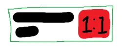
So for example, using the attached image as a reference, if the parent (green box) element's width is 100px, the text (black lines in the box) takes 90px with a height of 20px, then the image (red box) is going to be 20px heigh, and should also be 20px wide. This will of course make the text wrap onto a new line, increasing the height to something like 40px, which further increases the width of the image, but I assume there will be a point where there will be a stable width and height. I have done something like this in Figma, so I assumed it should also be possible with CSS.

I have achieved getting the image the full height of the parent element using flex: 1;, since the parent element is a flexbox, but I can't seem to get the width the same as the height. I tried using aspect-ratio: 1; to keep the aspect ratio a square, and setting flex-shrink to 0 to prevent the element from shrinking, but this seems to have no effect.

I've seen 'hacks' online where people will use padding-bottom, however this only seems to work for getting the height the same as the width, and not the other way around.

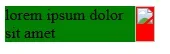
Here's an example of how the layout currently is:
HTML:
<style>
.parent {
  width: 150px;
  height: auto;
  background-color: green;
  display: flex;
  justify-content: space-between;
}

.text {
  margin: 0;
}

.image {
  min-width: 10px;
  flex: 1 0;
  aspect-ratio: 1;
  background-color: red;
}
</style>

<div class="parent">
  <p class="text">lorem ipsum dolor sit amet</p>
  <div class="image"></div>
</div>

Any help and suggestions are greatly appreciated, thank you.
 

Attachments
  • 1743089369435.webp
    1743089369435.webp
    5.8 KB · Views: 3
Last edited:
Hi everyone,

I'm trying to get a simple layout, with text and an image side-by-side. The text should take up as much horizontal space as needed, the image will take up the height of the parent element, and then must be a square.

So for example, using the attached image as a reference, if the parent (green box) element's width is 100px, the text (black lines in the box) takes 90px with a height of 20px, then the image (red box) is going to be 20px heigh, and should also be 20px wide. This will of course make the text wrap onto a new line, increasing the height to something like 40px, which further increases the width of the image, but I assume there will be a point where there will be a stable width and height. I have done something like this in Figma, so I assumed it should also be possible with CSS.

I have achieved getting the image the full height of the parent element using flex: 1;, since the parent element is a flexbox, but I can't seem to get the width the same as the height. I tried using aspect-ratio: 1; to keep the aspect ratio a square, and setting flex-shrink to 0 to prevent the element from shrinking, but this seems to have no effect.

I've seen 'hacks' online where people will use padding-bottom, however this only seems to work for getting the height the same as the width, and not the other way around.

Here's an example of how the layout currently is:
HTML:
<style>
.parent {
  width: 150px;
  height: auto;
  background-color: green;
  display: flex;
  justify-content: space-between;
}

.text {
  margin: 0;
}

.image {
  min-width: 10px;
  flex: 1 0;
  aspect-ratio: 1;
  background-color: red;
}
</style>

<div class="parent">
  <p class="text">lorem ipsum dolor sit amet</p>
  <div class="image"></div>
</div>

Any help and suggestions are greatly appreciated, thank you.
Does this get you closer?


HTML:
<!DOCTYPE html>
<html lang="en">
<head>
    <meta charset="UTF-8">
    <meta name="viewport" content="width=device-width, initial-scale=1.0">
    <title>Document</title>
    <style>
        .parent {
          width: 150px;
          height: auto;
          background-color: green;
          display: flex;
          justify-content: space-between;
        }
        
        .text {
          margin: 0;
        }
        
        .image img {
          min-width: 10px;
          flex: 1 0;
          aspect-ratio: 1;
          width: 100%;
          height: 100%;
          background-color: red;
        }
        </style>
</head>
<body>
    
        
        <div class="parent">
          <p class="text">lorem ipsum dolor sit amet</p>
          <div class="image"><img src="img/jakob-owens-St5bHbV-Ga4-unsplash.jpg" alt="" width="640" height="480"></div>
        </div>
</body>
</html>
 
Hi @tomliv,

Thanks for the response, but unfortunately, this doesn't seem to work. The width is still not the same as the height.

View attachment 2986

Your image is broken, soo not sure if that is the issue, however with one slight change:
CSS:
.image img {
          aspect-ratio: 1;
          background-color: red;
          height: 100%;
          min-width: 10px;
          object-fit: cover;
          width: 100%;
        }

I was able to get the image aspect working:

Parent flex would need to be adjusted I assume.
 
HTML:
<!DOCTYPE html>
<html lang="en">
<head>
  <meta charset="UTF-8">
  <meta name="viewport" content="width=device-width, initial-scale=1.0">
  <title>Text and Image Layout</title>
  <style>
    .parent {
      width: 150px;
      height: auto;
      background-color: green;
      display: flex;
      justify-content: space-between;
    }

    .text {
      margin: 0;
      width: 100%;
    }

    .image {
      width: 1em; /* Make the width the same as the text height */
      height: 1em; /* Keep the height the same as the width to make it square */
      background-color: red;
      flex-shrink: 0;
      aspect-ratio: 1; /* Ensure the aspect ratio remains 1:1 */
    }
  </style>
</head>
<body>

  <div class="parent">
    <p class="text">lorem ipsum dolor sit amet</p>
    <div class="image"></div>
  </div>

</body>
</html>
 
HTML:
<!DOCTYPE html>
<html lang="en">
<head>
  <meta charset="UTF-8">
  <meta name="viewport" content="width=device-width, initial-scale=1.0">
  <title>Text and Image Layout</title>
  <style>
    .parent {
      width: 150px;
      height: auto;
      background-color: green;
      display: flex;
      justify-content: space-between;
    }

    .text {
      margin: 0;
      width: 100%;
    }

    .image {
      width: 1em; /* Make the width the same as the text height */
      height: 1em; /* Keep the height the same as the width to make it square */
      background-color: red;
      flex-shrink: 0;
      aspect-ratio: 1; /* Ensure the aspect ratio remains 1:1 */
    }
  </style>
</head>
<body>

  <div class="parent">
    <p class="text">lorem ipsum dolor sit amet</p>
    <div class="image"></div>
  </div>

</body>
</html>
Hi @ratwolf, thanks for your response. This does work if the text is only on a single line, however I need it to also work when the text wraps on to a new line.

I may have to use JavaScript for this, but I was hoping it was possible with only CSS.
 
Hi @ratwolf, thanks for your response. This does work if the text is only on a single line, however I need it to also work when the text wraps on to a new line.

I may have to use JavaScript for this, but I was hoping it was possible with only CSS.
HTML:
<!DOCTYPE html>
<html lang="en">
<head>
  <meta charset="UTF-8">
  <meta name="viewport" content="width=device-width, initial-scale=1.0">
  <title>Text and Image Layout</title>
  <style>
    .parent {
      width: 100%;  /* Full width to adapt */
      height: auto;
      background-color: green;
      display: flex;
      flex-wrap: wrap;  /* Allow text and image to move to next line */
      justify-content: space-between;
      align-items: flex-start;  /* Align items to the top */
      gap: 10px;  /* Add space between text and image */
      padding: 10px;
      box-sizing: border-box;
    }

    .text {
      margin: 0;
      flex: 1;  /* Text takes up available space */
      white-space: normal;  /* Allow text to wrap */
    }

    .image {
      width: 1em;
      height: 1em;
      background-color: red;
      flex-shrink: 0;
      aspect-ratio: 1;
    }
  </style>
</head>
<body>

  <div class="parent">
    <p class="text">lorem ipsum dolor sit amet, consectetur adipiscing elit, sed do eiusmod tempor incididunt ut labore et dolore magna aliqua. Lorem ipsum dolor sit amet, consectetur adipiscing elit, sed do eiusmod tempor incididunt ut labore et dolore magna aliqua.</p>
    <div class="image"></div>
  </div>

</body>
</html>
 
This may be a bit closer:

HTML:
<!DOCTYPE html>
<html lang="en">
<head>
    <meta charset="UTF-8">
    <meta name="viewport" content="width=device-width, initial-scale=1.0">
    <title>Document</title>
    <style>
        .parent {
          /* width: 150px; */
          height: auto;
          background-color: green;
          display: flex;
          justify-content: space-between;
          align-items: stretch;
        }
        
        .text {
            flex: 0 0 50%;
            margin: 0;
        }
        
        .image{
          aspect-ratio: 1;
          background-color: red;
          background-image: url(img/jakob-owens-St5bHbV-Ga4-unsplash.jpg);
          background-size: cover;
          background-repeat: no-repeat;
          background-position: center;
          flex: 0 0 50%;
        }
        </style>
</head>
<body>
    
        
        <div class="parent">
        <div class="text">
            <p>lorem ipsum dolor sit amet</p>
        </div>
        <div class="image">
            <!-- <img src="img/jakob-owens-St5bHbV-Ga4-unsplash.jpg" alt="" width="640" height="480"> -->
        </div>
        </div>
</body>
</html>

However I am thinking this might not ever work as at some point, whether you specify it or the viewport dictates it, you will hit a max width and at that point the parent would only ever be able to get taller. Specifying 50% width on the image and text only leaves the image one choice and that would be to get taller but not wider as it would be at that 50% already. Hope that makes sense.
 
Back
Top Bottom