Hi everyone,
I'm trying to get a simple layout, with text and an image side-by-side. The text should take up as much horizontal space as needed, the image will take up the height of the parent element, and then must be a square.
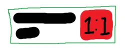
So for example, using the attached image as a reference, if the parent (green box) element's width is 100px, the text (black lines in the box) takes 90px with a height of 20px, then the image (red box) is going to be 20px heigh, and should also be 20px wide. This will of course make the text wrap onto a new line, increasing the height to something like 40px, which further increases the width of the image, but I assume there will be a point where there will be a stable width and height. I have done something like this in Figma, so I assumed it should also be possible with CSS.
I have achieved getting the image the full height of the parent element using
I've seen 'hacks' online where people will use
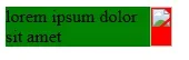
Here's an example of how the layout currently is:
Any help and suggestions are greatly appreciated, thank you.
I'm trying to get a simple layout, with text and an image side-by-side. The text should take up as much horizontal space as needed, the image will take up the height of the parent element, and then must be a square.
So for example, using the attached image as a reference, if the parent (green box) element's width is 100px, the text (black lines in the box) takes 90px with a height of 20px, then the image (red box) is going to be 20px heigh, and should also be 20px wide. This will of course make the text wrap onto a new line, increasing the height to something like 40px, which further increases the width of the image, but I assume there will be a point where there will be a stable width and height. I have done something like this in Figma, so I assumed it should also be possible with CSS.
I have achieved getting the image the full height of the parent element using
flex: 1;, since the parent element is a flexbox, but I can't seem to get the width the same as the height. I tried using aspect-ratio: 1; to keep the aspect ratio a square, and setting flex-shrink to 0 to prevent the element from shrinking, but this seems to have no effect.I've seen 'hacks' online where people will use
padding-bottom, however this only seems to work for getting the height the same as the width, and not the other way around.Here's an example of how the layout currently is:
HTML:
<style>
.parent {
  width: 150px;
  height: auto;
  background-color: green;
  display: flex;
  justify-content: space-between;
}

.text {
  margin: 0;
}

.image {
  min-width: 10px;
  flex: 1 0;
  aspect-ratio: 1;
  background-color: red;
}
</style>

<div class="parent">
  <p class="text">lorem ipsum dolor sit amet</p>
  <div class="image"></div>
</div>
Any help and suggestions are greatly appreciated, thank you.
Attachments
Last edited: