Welcome to Code Forum!

Join a community that supports you and your coding journey from day one. We strive to be a friendly, supportive community that empowers everyone to be better developers. By registering with us, you'll be able to discuss, share and private message with other members of our community.

SignUp Now!
  • Guest, before posting your code please take these rules into consideration:
    • It is required to use our BBCode feature to display your code. While within the editor click < / > or >_ and place your code within the BB Code prompt. This helps others with finding a solution by making it easier to read and easier to copy.
    • You can also use markdown to share your code. When using markdown your code will be automatically converted to BBCode. For help with markdown check out the markdown guide.
    • Don't share a wall of code. All we want is the problem area, the code related to your issue.

    GIF shows where to locate </> in the thread and or post editor toolbar.
    To learn more about how to use our BBCode feature, review our "How to post your code into threads" here.

    Thank you, Code Forum.

CSS Autofill breaks Glassmorphism

I'm trying to create a form and in my text input field I'm using glassmorphism. But when someone autofill the glassmorphism effect disappears.

v3rTY.png

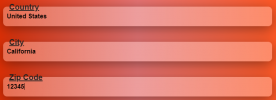
In this picture the first field is manually typed but the last two field are autofilled. As you can see in the first field the glassmorphism effect is visible but in the last two it isn't.

.Text_Input { background: rgba(255, 255, 255, 0.3); box-shadow: 0 8px 32px 0 rgba(0, 0, 0, 0.4); backdrop-filter: blur( 7.0px ); -webkit-backdrop-filter: blur( 7.0px ); top: 0px; left: 0px; width: calc(100% - 40px); height: 100%; border: none; border-radius: 10px; outline: none; padding: 20px; font-weight: bold; font-size: 20px; } .Text_Input:-webkit-autofill { background-clip: text; -webkit-background-clip: text; } <input class="input__field" type="text" /> <label class="input"> {label} </label>

I've been stuck with this problem for more than two days. Can't find a solution.
 
Solution
Try this -
CSS:
body {
    font-family: system-ui;
    background: rgb(221,44,0) !important;
    background: linear-gradient(90deg, rgba(221,44,0,1) 0%, rgba(229,115,115,1) 50%, rgba(255,87,34,1) 100%) !important;
    color: #000000;
    text-align: center;
}
.text-card {
    display: block;
    position: relative;
    margin: 40px 0;
}
.text-input {
    background: rgba(255, 255, 255, 0.3);
    box-shadow: 0 8px 32px 0 rgba(0, 0, 0, 0.4);
    backdrop-filter: blur( 7px );
    -webkit-backdrop-filter: blur( 7px );
    box-sizing: border-box;
    width: calc(100% - 12px);
    height: 50px;
    border-radius: 10px;
    border: none;
    resize: none;
    outline: none;
    padding: 10px;
    font-weight: bold;
    font-size: 16px;
}...
Your css class and html class does not match. Please provide complete code.
<label className="Text_Card" htmlFor={id}> <input key={resetKey} id={id} name={name} type={type || "text"} value={value || ""} className="Text_Input" onChange={(e) => setValue(e.target.value)} onFocus={() => setIsFocused(true)} onBlur={() => setIsFocused(false)} aria-invalid={!isValid} aria-describedby={!isValid ? `${id}-error` : null} /> <span className="Text_Card_Label"> {label} </span> </label> .Text_Card { position: relative; } .Text_Input { background: rgba(255, 255, 255, 0.3); box-shadow: 0 8px 32px 0 rgba(0, 0, 0, 0.4); backdrop-filter: blur( 7.0px ); -webkit-backdrop-filter: blur( 7.0px ); box-sizing: border-box; width: calc(100% - 12px); height: 50px; border-radius: 10px; border: none; resize: none; outline: none; padding: 10px; font-weight: bold; font-size: 16px; margin-top: 20px; margin-bottom: 20px; } .Text_Input:-webkit-autofill { background-clip: text; -webkit-background-clip: text; } .Text_Card_Label { position: absolute; left: 0; top: 0; white-space: nowrap; transform: translate(16px, -26px); font-weight: bold; font-size: 20px; text-decoration: underline; }

It might look a bit different because I have changed couple of things. But glassmorphism still don't work.
 
I have just made some adjustment according to me. Try to add your effect in my code and paste here.
HTML -
HTML:
<!DOCTYPE html>

<html lang="en">

<head>
    <meta charset="UTF-8">
    <title>Glassmorphism</title>
    <meta http-equiv="Content-Type" content="text/html"/>
    <link type="text/css" rel="stylesheet" href="style.css">
</head>

<body>
    <div>
        <label class="text-card" htmlFor="field1">
            <input id="field1" name="Country" type="text" class="text-input" />
            <span class="text-card-label">Country</span>
        </label>
        
        <label class="text-card" htmlFor="field2">
            <input id="field2" name="City" type="text" class="text-input" />
            <span class="text-card-label">City</span>
        </label>
        
        <label class="text-card" htmlFor="field3">
            <input id="field3" name="Zip" type="text" class="text-input" />
            <span class="text-card-label">Zip Code</span>
        </label>
    </div>
</body>

</html>
CSS -
CSS:
body {
    font-family: system-ui;
    background: rgb(221,44,0) !important;
    background: linear-gradient(90deg, rgba(221,44,0,1) 0%, rgba(229,115,115,1) 50%, rgba(255,87,34,1) 100%) !important;
    color: #000000;
    text-align: center;
}

.text-card {
    display: block;
    position: relative;
    margin: 40px 0;
}

.text-input {
    background: rgba(255, 255, 255, 0.3);
    box-shadow: 0 8px 32px 0 rgba(0, 0, 0, 0.4);
    backdrop-filter: blur( 7.0px );
    -webkit-backdrop-filter: blur( 7.0px );
    box-sizing: border-box;
    width: calc(100% - 12px);
    height: 50px;
    border-radius: 10px;
    border: none;
    resize: none;
    outline: none;
    padding: 10px;
    font-weight: bold;
    font-size: 16px;
}

.text-input:-webkit-autofill {
    background-clip: text;
    -webkit-background-clip: text;
}


.text-card-label {
    position: absolute;
    left: 16px;
    top: 10px;
    color: #a6280b;
    white-space: nowrap;
    font-weight: bold;
    font-size: 20px;
    text-decoration: underline;
    transition: .3s;
    pointer-events: none;
}

.text-input:focus + .text-card-label {
    top: -20px;
    color: #e97a65;
    font-size: 15px;
}
Add your effect in this code add paste back the full code here.
 
HTML
<!DOCTYPE html> <html lang="en"> <head> <meta charset="UTF-8"> <title>Glassmorphism</title> <meta http-equiv="Content-Type" content="text/html"/> <link type="text/css" rel="stylesheet" href="style.css"> </head> <body> <div> <label class="text-card" htmlFor="field1"> <input id="field1" name="Country" type="text" class="text-input" /> <span class="text-card-label">Country</span> </label> <label class="text-card" htmlFor="field2"> <input id="field2" name="City" type="text" class="text-input" /> <span class="text-card-label">City</span> </label> <label class="text-card" htmlFor="field3"> <input id="field3" name="Zip" type="text" class="text-input" /> <span class="text-card-label">Zip Code</span> </label> </div> </body> </html>

CSS
body { font-family: system-ui; background: rgb(221,44,0) !important; background: linear-gradient(90deg, rgba(221,44,0,1) 0%, rgba(229,115,115,1) 50%, rgba(255,87,34,1) 100%) !important; color: #000000; text-align: center; } .text-card { display: block; position: relative; margin: 40px 0; } .text-input { background: rgba(255, 255, 255, 0.3); box-shadow: 0 8px 32px 0 rgba(0, 0, 0, 0.4); backdrop-filter: blur( 7.0px ); -webkit-backdrop-filter: blur( 7.0px ); box-sizing: border-box; width: calc(100% - 12px); height: 50px; border-radius: 10px; border: none; resize: none; outline: none; padding: 10px; font-weight: bold; font-size: 16px; } .text-input:-webkit-autofill { background-clip: text; -webkit-background-clip: text; } .text-card-label { position: absolute; left: 16px; top: 10px; color: #000000; white-space: nowrap; transform: translate(16px, -26px); font-weight: bold; font-size: 20px; text-decoration: underline; pointer-events: none; }

Just autofill one field and manually type other field, You will be able to see the difference. Autofill destroy the blur effect, which I don't want.
 
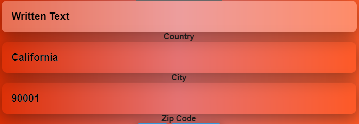
Manually Typed
1.PNG

Autofilled
2.PNG

In the first picture there is a slight white color in every input field. But in the second picture the slight white color is missing and it's transparent. When someone autofill the form, the slight white color disappears. But I don't want that slight white color to disappear.
 
Try this -
CSS:
body {
    font-family: system-ui;
    background: rgb(221,44,0) !important;
    background: linear-gradient(90deg, rgba(221,44,0,1) 0%, rgba(229,115,115,1) 50%, rgba(255,87,34,1) 100%) !important;
    color: #000000;
    text-align: center;
}
.text-card {
    display: block;
    position: relative;
    margin: 40px 0;
}
.text-input {
    background: rgba(255, 255, 255, 0.3);
    box-shadow: 0 8px 32px 0 rgba(0, 0, 0, 0.4);
    backdrop-filter: blur( 7px );
    -webkit-backdrop-filter: blur( 7px );
    box-sizing: border-box;
    width: calc(100% - 12px);
    height: 50px;
    border-radius: 10px;
    border: none;
    resize: none;
    outline: none;
    padding: 10px;
    font-weight: bold;
    font-size: 16px;
}
.text-input:-webkit-autofill,
.text-input:-webkit-autofill:hover,
.text-input:-webkit-autofill:focus,
.text-input:-webkit-autofill:active {
    -webkit-transition-delay: 99999s;
}
.text-card-label {
    position: absolute;
    left: 16px;
    top: 10px;
    color: #000000;
    white-space: nowrap;
    transform: translate(16px, -40px);
    font-weight: bold;
    font-size: 20px;
    text-decoration: underline;
    pointer-events: none;
}
 
Solution
Try this -
CSS:
body {
    font-family: system-ui;
    background: rgb(221,44,0) !important;
    background: linear-gradient(90deg, rgba(221,44,0,1) 0%, rgba(229,115,115,1) 50%, rgba(255,87,34,1) 100%) !important;
    color: #000000;
    text-align: center;
}
.text-card {
    display: block;
    position: relative;
    margin: 40px 0;
}
.text-input {
    background: rgba(255, 255, 255, 0.3);
    box-shadow: 0 8px 32px 0 rgba(0, 0, 0, 0.4);
    backdrop-filter: blur( 7px );
    -webkit-backdrop-filter: blur( 7px );
    box-sizing: border-box;
    width: calc(100% - 12px);
    height: 50px;
    border-radius: 10px;
    border: none;
    resize: none;
    outline: none;
    padding: 10px;
    font-weight: bold;
    font-size: 16px;
}
.text-input:-webkit-autofill,
.text-input:-webkit-autofill:hover,
.text-input:-webkit-autofill:focus,
.text-input:-webkit-autofill:active {
    -webkit-transition-delay: 99999s;
}
.text-card-label {
    position: absolute;
    left: 16px;
    top: 10px;
    color: #000000;
    white-space: nowrap;
    transform: translate(16px, -40px);
    font-weight: bold;
    font-size: 20px;
    text-decoration: underline;
    pointer-events: none;
}
OMG.....I only had to change this🤦‍♀️
.text-input:-webkit-autofill, .text-input:-webkit-autofill:hover, .text-input:-webkit-autofill:focus, .text-input:-webkit-autofill:active { -webkit-transition-delay: 99999s; transition-delay: 99999s; }
You are a actual live save. You made my day. It's working perfectly. Thanks a lot. Really appreciate you help.😊
 

Latest posts

Buy us a coffee!

Buy me a coffee.
Back
Top Bottom